ABout Bidsters.
Bidsters is an online application that facilitates contact management, bid invitation tracking, contextual data syncing, and a data analytics dashboard for keeping tabs on the most important information gained from a bid campaign.
Steering Product Design with Precision.
Solving Connectivity Challenges.
The process of submitting bids for building projects is now more than just a numbers game. Relationship management with suppliers and subcontractors can be challenging.
Some of the problems are listed below.
1. Problems maintaining connections with others
2. It can be difficult to keep tabs on people's replies to bid requests.
3. Disconnect between different sources of context data
4. It's difficult to keep track of vital information about bid activities.
Revamping Efficiency.
The goal of this project is to redesign and create a web application that makes it easier to manage contacts, follow up on bid invitations, synchronise data sources, keep track of important insights about bid efforts, offer a user-friendly and unified interface, and give users control over how they interact with the application. The redesign is necessary because the application's prior design did not fully meet the needs of the users. This project aims to enhance user experience and increase effectiveness and efficiency for users. The user story will help you comprehend the problems and the justification for the redesign as you read it.
Uncovering Insights:
Research Deliverables
As part of the redesign process, I conducted a heuristic evaluation of the outdated web application design using Jakob Nielsen's interaction design heuristics. The evaluation was conducted using the following principles:
During the evaluation, I noticed a few areas that could be improved:
Aesthetic and minimalist design:
The interface was a little cluttered, making it hard to find what you were looking for. I recommended reorganizing things to make it more navigable.
Consistency and standards:
I found some inconsistencies in the web application and suggested using standardized patterns to make the interface more predictable and consistent.
User control and freedom:
I also considered how many different ways users could carry out a single action. I will be designing multiple flows to achieve some tasks in order to give users more control over how they interact with the application.
User personas
INFORMATION ARCHITECTURE
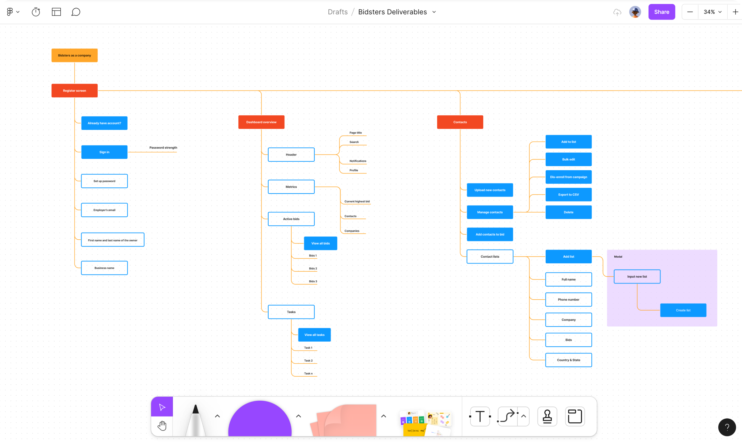
Given the project's complexity, implementing an effective information architecture was critical to ensuring a clear and intuitive user experience. This allowed me, as the designer, and the stakeholders, to have a thorough understanding of the flow and organisation of the application's content and functionality.
An information architecture is an important part of the design process because it provides a structured approach to organising and labelling information on a website or application. It helps to improve accessibility and findability, as well as overall usability for the end user. I was able to develop an information architecture that effectively met the needs and goals of the Bidsters project by conducting research, creating wireframes and sitemaps, and testing with users.

Bringing ideas to life:
A visual journey
The authentication process was designed to be simple for users. We provided two options for authentication: social login and email authentication. With social login, users can quickly and easily log in with their existing social media accounts. We created a simple email login form for users who prefer to use email authentication.
Once users have logged in with their email address, they must confirm their email. We send a confirmation email to the user's email address, and users then click the confirmation link in the email to complete the verification process.
We tried to make authentication easy while ensuring user accounts were safe. With this approach, users can quickly and easily access the platform without any hassle while protecting their accounts.
Let’s dive in.
Let's start with the dashboard overview. The overview provides users with comprehensive information on their bidding activities. The dashboard's metrics and information are based on user feedback to ensure they are useful and important. Users can view their tasks and active bids, making it easier to keep track of their progress.
Contact.
In the contacts section, users can add and remove contacts and perform actions on groups of contacts. Contacts are organised into lists, making it easy for users to navigate through them.
BIDS.
In the bids section, users can create, pause, and end their bids. This section is critical as it is the core of the platform's purpose.
Task.
Tasks are an essential feature of the Bidsters platform as they enable users to assign tasks to team members. This feature ensures that everyone is on the same page and that tasks are completed on time.
Organisation management.
Lastly, users can manage multiple organisations on the platform. They can switch between organisations and add team members as needed, with the ability to designate them as admins or regular members. The organisation feature ensures the platform is flexible enough to cater to different businesses needs.
CONCLUSION.
Lastly, users can manage multiple organisations on the platform. They can switch between organisations and add team members as needed, with the ability to designate them as admins or regular members. The organisation feature ensures the platform is flexible enough to cater to different businesses needs.