LockedIn
Visit platformOne word arrives, then the next, each in the same place, each held just long enough.
When your attention settles, the page begins to feel less like a wall of text and more like a guided path.
The words keep their natural rhythm, but the current line becomes the place your eyes can safely stay.
A full paragraph can still feel quiet, direct, and easy to follow when the interface lowers the noise.
The surrounding sentences remain visible, softened enough to give context without asking for attention.
Each movement feels intentional, like the reader is being carried through the page one thought at a time.
Instead of scanning ahead or drifting backward, your focus moves with the story at a controlled pace.
The active line becomes a calm anchor while the rest of the page keeps its shape around it.
That small shift makes longer passages feel lighter without hiding the book or breaking the flow.
The goal is not to remove the page, but to make the current idea easier to meet and understand.
A good reading surface gives the eye enough context and then gently lowers everything else.
It should feel like the book is still there, only calmer, clearer, and more patient with your attention.
The next line approaches with a soft glide rather than a hard jump that pulls you out of the sentence.
The previous line remains nearby for a moment, then fades into the background as the passage continues.
That motion helps the reader trust where they are and where the paragraph is going next.
The interface disappears into the rhythm, leaving only the page, the pace, and the meaning.
Longer paragraphs become less demanding because attention is carried one line at a time through the text.
This is the feeling the reading mode is meant to protect when a book becomes dense or tiring.
A research-led case study for a focus-first reading app, from a personal problem to a tested product.
How to read this dossier
This is the story of LockedIn told the way it actually happened, as a research-led design that grew through rounds of user testing, not a straight line. It is organised so you can follow the reasoning end to end:
Why I built this
LockedIn started as a fix for my own problem. I struggle to read without getting lost and overwhelmed, my eyes slip between lines, my attention drifts, and a long document feels like a wall before I have read a sentence. I am not alone in this, but building the tool I personally needed is what set the direction.
The kind of designer I am: I take complex things and make them simple, and try to make the simple version genuinely enjoyable to use. That instinct, strip away everything that is not the reading, became the aesthetic and the strategy of the whole product.
What I set out to learn: I wanted to practise research-led design, to ship a full product that is heavily shaped by research, by real users, and by statistics, rather than by taste alone. LockedIn is my proof-of-work for that goal, and this dossier is the evidence of whether I reached it.
Defining the problem
The easy way to state this problem is “people find it hard to read.” That is too vague to design against. The sharper framing:
People don’t fail to read because they cannot read. They fail because modern reading creates too much cognitive friction before momentum is established.
Reading only becomes effortless once you are absorbed. Everything before that is friction:
Opening a 350-page book feels overwhelming before a word is read.
A full page makes the brain estimate the effort required, and that estimate is discouraging.
Phones constantly interrupt attention, and every interruption forces you to relocate where you stopped.
Eyes fatigue and lose their place tracking across long lines.
Slow, invisible progress kills motivation; reading offers almost no immediate reward.
29%
of readers have never finished a book they started.
12.6
5
books the average adult starts a year, and finishes.
29×
more likely to read another once you finish one.
What the research told me
I grounded the product in existing research before committing to an interface. Five ideas did the heavy lifting, and one honest constraint kept me disciplined.
The frameworks
Cognitive Load Theory (Sweller). Working memory is limited; a full page spends effort on managing the page, not understanding it. → Show one focal unit at a time.
Visual attention (fixations, saccades, regressions). Reading jumps and backtracks; big blocks demand more eye travel and lost place. → Minimise eye travel, but preserve backtracking.
Goal-Gradient Effect (Hull). Motivation rises as the finish line becomes visible. → Show “minutes left,” not “page 7 of 350.”
Zeigarnik Effect. We feel a pull toward unfinished tasks; a clean stop resolves tension. → Stop at meaningful boundaries and use the open loop to return.
Flow (Csikszentmihalyi). Absorption needs distractions to disappear. → Strip visual clutter.
The honest constraint
RSVP, showing words one at a time, is the mechanic, but the literature is blunt: “modern speed-reading apps do not foster reading comprehension.” At a comfortable 250–350 WPM there is no comprehension loss, but above ~400 WPM understanding drops 20–40%, because RSVP removes the regressions readers rely on. This did not kill the idea; it set the rules: default to a comfortable pace, hand back rewind, and, as testing later proved, give context back to the reader.
Accessibility, the strongest positive signal
The most supportive evidence is about focus, not speed: readers with ADHD comprehended ~13% better with RSVP than with normal reading, and researchers suggested it as a reading aid. Meanwhile, accessibility research shows comfort must be adjustable, spacing, size, and legible type matter more than any “dyslexia font.” This pointed the product at focus-challenged readers (me included) and told me to make comfort a first-class control.
The landscape, and the gap
I looked at what already exists, and critiqued it against what I was trying to do.
Product
Mechanic
Strength
Gap for LockedIn
Spritz
Pure RSVP + red ORP letter
Recognizable, fast
Oversells comprehension; no library; the academic critique targets it
Spreeder
RSVP + highlighting, 46 formats, drills
Feature-complete
Feels like a speed-reading course, heavy, intimidating
BeeLine Reader
Colour-gradient text (not RSVP)
Readers got ~50% further into articles
Mixed results for beginners; can hurt some readers
Outread / ReadOwl
RSVP + EPUB
Mobile-native
Commodity RSVP; no focus / accessibility framing
The gap I designed into: everyone sells speed; almost no one sells completion and calm. No competitor leads with focus and accessibility, the strongest evidence in the field, few let you read your own content in a real library, and none design the pre-reading moment that makes finishing feel achievable. That is where LockedIn lives.
Design principles
The rules I held every decision against. Each links a research finding to the product.
Reduce perceived effort
The page looks like work before it is work. So never show the wall.
Stream one focal unit at a time; show “minutes left,” not page counts
Per-chapter time estimates so a reader can pick what fits the ten minutes they have.
Reduce cognitive load
Remove the navigation job so the mind is free to understand.
A fixed focal point with an ORP pivot letter; a calm, near-monochrome frame.
Only what you need on screen, when you need it.
Protect comprehension over speed
Comprehension is the priority; speed is the least of my concerns
A comfortable default pace, and rewind as a primary control.
Smart timing (pauses at commas and full stops); an escape hatch to normal pages.
Protect attention
The core user is someone who gets overwhelmed by dense text, including me.
Dark, low-stimulation frame; steady, calm motion; minimal controls.
A gentle motivational layer, never guilt-driven.
Let people read their own way
One presentation excludes the very readers this is for.
Three reading modes on a context dial, Word, Focus, Line.
Adjustable size, weight, spacing, and theme
Keep it theirs
Personal, private, and free of catalogue friction.
Your own uploaded books; resume at the exact word; exportable notes.
The design journey, iterations
LockedIn did not arrive fully formed. It grew through rounds of watching ~7 people (friends and classmates) read on the app, and changing it when they struggled. Here is the honest path, feedback and all.
The starting bet
The first version was mobile-first and deliberately minimal: a Library, book info, the reader, highlights, an outline, profile and settings, with a single-word RSVP reader at its heart. One word at a time, at a set speed. It was the simplest possible expression of the idea, and the right place to start, but it was too pure.
It felt robotic, and I couldn’t follow
What I heard: Some testers found single-word streaming incoherent, “just reading through words,” unable to reassemble them into a sentence, and it felt robotic
What I did: Two responses. First, smart timing: pauses tuned around commas, full stops and line breaks, so the stream carries a sentence’s natural rhythm instead of a metronome’s. Second, a new Focus mode, the focal word shown inside its faded sentence, current word bolded in place, so the reader can see where they are without losing the calm of one word at a time.
Why: Pure RSVP strips away the context (regressions, sentence shape) that comprehension depends on. Giving a little of it back was the fix the research predicted and testing confirmed.
One word arrives, then the next, each in the same place, each held just long enough.
When your attention settles, the page begins to feel less like a wall of text and more like a guided path.
The words keep their natural rhythm, but the current line becomes the place your eyes can safely stay.
A full paragraph can still feel quiet, direct, and easy to follow when the interface lowers the noise.
The surrounding sentences remain visible, softened enough to give context without asking for attention.
Each movement feels intentional, like the reader is being carried through the page one thought at a time.
Instead of scanning ahead or drifting backward, your focus moves with the story at a controlled pace.
The active line becomes a calm anchor while the rest of the page keeps its shape around it.
That small shift makes longer passages feel lighter without hiding the book or breaking the flow.
The goal is not to remove the page, but to make the current idea easier to meet and understand.
A good reading surface gives the eye enough context and then gently lowers everything else.
It should feel like the book is still there, only calmer, clearer, and more patient with your attention.
The next line approaches with a soft glide rather than a hard jump that pulls you out of the sentence.
The previous line remains nearby for a moment, then fades into the background as the passage continues.
That motion helps the reader trust where they are and where the paragraph is going next.
The interface disappears into the rhythm, leaving only the page, the pace, and the meaning.
Longer paragraphs become less demanding because attention is carried one line at a time through the text.
This is the feeling the reading mode is meant to protect when a book becomes dense or tiring.
“I get lost between the lines”, including me
What I heard: Watching people read, I saw a recurring pattern: some readers lose their place between lines of a paragraph. I am one of them, it is the exact problem that started this project.
What I did: I built Line mode: a whole sentence or line lit bright while the surrounding paragraph is ghosted, so there is no place to get lost. It matured with smart line wrapping (so phrases don’t break awkwardly), AIassisted line segmentation, and manual or automatic advance.
The insight that tied it together: Word, Focus and Line are not three unrelated features, they are three points on a single context dial. Word gives zero context, Focus gives sentence context, Line gives paragraph context. Instead of forcing one compromise between focus and comprehension, I let the reader choose where on that dial they sit. This is the idea I am proudest of, and it is a direct, authored answer to the research’s central tension.
“350 pages” was the wrong number to show
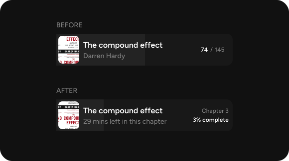
What I heard: I reframed the pre-reading screen around time, not pages: “minutes left,” chapter progress, and a finish estimate. A reader now commits to a short, focused window rather than staring down a total.
What I did: I reframed the pre-reading screen around time, not pages: “minutes left,” chapter progress, and a finish estimate. A reader now commits to a short, focused window rather than staring down a total.
Why: Goal-gradient psychology: a visible, attainable finish line motivates; an intimidating total discourages. Same book, a completely different feeling.
Making the escape hatch real, page awareness
What I heard: Because text streams word- or line-at-a-time, some pages (acknowledgements, forewords) aren’t worth streaming, and jumping between pages was hard.
What I did: I added real page starts, then upgraded plain page references to page thumbnails you can click to seek, so readers jump chapter-to-chapter to what actually matters to read.
Why: RSVP is bad at non-linear or non-prose content; respecting the reader’s time means letting them skip it, not forcing it through the stream
Removing the friction of starting
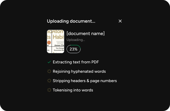
Getting a book in had to be effortless. Upload went from a blocking, simple flow to a product-grade pipeline: web PDF support, non-blocking background extraction, live progress, a floating progress card, a completion toast, and confirm-and-undo delete. The Library grew from a bare list into an empty-state prompt, a “currently reading” section, and real book cards, and selecting a book now opens a slide-in info drawer instead of yanking you to a new screen.
Making it feel calm
A lot of late work was not “features” but feel: press and hover states, animated tab switches, panels that slide rather than snap, reader controls that fade away while playing and return on demand, and less flicker across mobile and desktop. For a product whose entire promise is calm focus, the motion and restraint are the product.
A note on naming
The modes were not always called Word, Focus and Line. Earlier explorations tried Spotlight, Line and Cockpit. I dropped them because the names should describe the reading experience in plain language a firsttime user understands, “Word,” “Focus,” “Line” say what they do. Even the labels went through iteration.
The reader today, the context dial
The heart of LockedIn is three reading modes the reader switches between with one tap:
Mode
What it shows
Context level
Word
One word alone at the fixed point, fixation guides above and below, nothing else
Zero context, maximum focus; the purest RSVP
Focus
The big focal word at centre, with the full sentence faded above it and the current word bolded in place
Sentence context, focus without losing the thread
Line
A whole sentence / line lit bright, the surrounding paragraph ghosted
Paragraph context, natural rhythm; for readers who get lost between lines
Around them sit the controls the research demanded: a comfortable default speed with a simple stepper; play/pause; rewind and chapter-seek; smart punctuation timing; a Highlight / Note action pill for capturing passages; and a page view for anything RSVP handles badly. The frame is near-monochrome and, after a development constraint forced the issue, uses just two type weights, semi-bold and regular, so nothing competes with the word you are reading.
Making & choice of medium
The process ran from rough hand sketches, chasing the simplest, least distracting layout, into Figma (the “Focal” file), and from Figma into working code using the Figma MCP, in React Native and Expo. Designing and building in the same hands meant the reader’s timing and motion could be tuned where they actually live: in the running app, not a static mockup.
When making changed the design
Building surfaced things Figma could not. Layouts that looked right in Figma broke across real screen sizes, and font-weight choices that felt fine in the mockup turned muddy in development. The fix became a design decision: collapse the whole system to two weights, semi-bold and regular. A constraint I discovered by building ended up reinforcing the simplicity I was after in the first place. Likewise, the “robotic” feel of the word stream was only obvious once it was moving, which is what drove smart timing and Focus mode.
Why this medium
The stack is React Native + Expo because the project began mobile-first, from an early demo, and mobile is where the focus-reading experience matters most. The alternative I weighed was a web-first build in Next.js with Tailwind; I chose against it because the work started on mobile and the reading engine’s timing and gestures belong on-device. The reader logic is kept separable so the same cadence can be reused on the desktop web build.
Validation
Testing was moderated and observational: I sat with roughly seven friends and classmates and watched them read. Watching, rather than only asking, is how I could see comprehension breaking in real time, and it is directly what produced Line mode and the smart-timing work. The most encouraging moment came from a tester who captured the whole thesis without prompting:
This looks so nice and fascinating, and I think I might get used to reading again if I do this often, tester
Get used to reading again” is exactly the goal , not speed, but returning to reading and finishing. The next round of validation is a public LinkedIn call to widen the tester pool beyond people I know, and to start measuring comprehension and completion rather than only observing them.
Reflection
When making changed the design
I started by designing what I thought was elegant and testing it afterwards. Across these iterations that inverted: watching people read became my primary design tool, and the biggest ideas, Focus mode, Line mode, the timing work, came from observed struggle, not from the whiteboard. My learning goal was to practise research-led design; the honest result is that I got better at letting research and real users overrule my first instinct, which is the skill I actually wanted
Ethics and honest tradeoffs
Speed vs comprehension. RSVP can make people read faster while understanding less. I resolved this by priority: comprehension over speed, always. The mission is getting people back to reading and helping them focus, speed is the least of my concerns, and the smart timing, comfortable defaults, and Focus mode are the design expression of that stance.
A motivational layer, used carefully. LockedIn borrows engagement mechanics, progress, streaks, gentle goals, from the same attention-economy playbook that makes apps hard to put down. I think that is defensible here because the mechanics point at a healthier end (focusing and finishing a book you chose, which has an ending) rather than an infinite feed, and because the streaks are kept gentle rather than guiltdriven. But it is a tension worth naming honestly, not hiding.
Not a medical tool. LockedIn helps focus and is informed by focus research, but it is positioned as a reading aid, never a treatment for ADHD or dyslexia.
AI and privacy. The app uses AI for line segmentation and synopses, and users upload their own books. I plan to add a clear caution wherever AI is involved, and to treat uploaded documents as private by default.
Get used to reading again” is exactly the goal, not speed, but returning to reading and finishing. The next round of validation is a public LinkedIn call to widen the tester pool beyond people I know, and to start measuring comprehension and completion rather than only observing them.
What is next
Wider testing via a public LinkedIn call, and measuring comprehension and completion, not just observing them.
A real data layer: persistent progress, highlights, streaks, and sync (the current build streams sample and uploaded text without a full backend).
Refining the context dial with what a larger, more diverse group of readers actually reaches for.
I built this to solve my own reading problem, and the research kept pushing me away from the flashy version (speed) toward the honest one (focus and finishing). The best feature I started with, raw speed, became the thing I designed against.
References