Figo full design dossier

Designing a financial platform that made stablecoins feel as familiar as traditional money.
Project overview
Figo is a fintech platform designed to help individuals receive international payments, send money across borders, and spend stablecoins as easily as traditional currency. It was created to remove many of the barriers associated with international payments, particularly for remote professionals in emerging markets who often experienced long settlement times, payment restrictions, and limited control over their finances.
I joined the company before Figo existed, while it was still operating as CollectAfrica. Following a strategic decision to pivot from a B2B operations platform to a consumer-focused financial platform, I became the sole product designer responsible for the end-to-end experience. My role extended beyond interface design and included product strategy, user research, interaction design, design systems, prototyping, design quality assurance, and close collaboration with engineering and the founder throughout the product lifecycle.
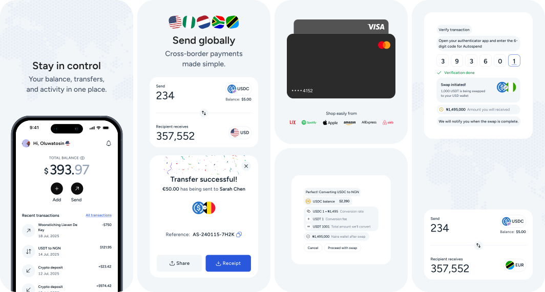
Over approximately thirteen months, I designed more than 200 screens across web and mobile, contributed to several key product decisions, and helped shape a platform that processed more than one million dollars in transactions within its first months of launch.
Responsibilities
As the only designer on the team, I was responsible for the complete product design lifecycle. My responsibilities included:
Defining the product experience from concept to launch.
Conducting user interviews and synthesising research findings.
Designing user flows and information architecture.
Building and maintaining the design system.
Creating high-fidelity interfaces and interactive prototypes.
Working closely with engineers during implementation.
Reviewing implemented features to ensure design quality.
Supporting product strategy through design recommendations and user insights.
Unlike many projects where design begins after product decisions have already been made, I was involved throughout product definition. This allowed me to influence not only how the product looked, but also what the product became.
Background
Figo began as CollectAfrica, a B2B operations platform that let businesses manage payments, inventory, approvals and team permissions in one place. While CollectAfrica addressed a genuine business problem, adoption proved challenging. Many small and medium-sized businesses were reluctant to introduce another operational platform during an economically difficult period.
At the same time, remote work was creating a different opportunity. More professionals in Nigeria, including designers, developers, writers, marketers, consultants, and software engineers, were working for companies outside the country. Although securing international work had become easier, receiving international payments remained frustrating. Users frequently waited between three and five business days before funds became available, while others experienced temporary account restrictions or unexpected compliance issues with international payment providers.
These observations prompted the company to reconsider its direction. Rather than continuing to focus on business operations tooling, the team decided to build a consumer financial product that would allow individuals to receive international payments faster and spend those funds more easily. This strategic pivot became Figo.
The problem
At first glance, stablecoins appeared to solve the problem almost immediately. They offered faster settlement, lower transaction costs, and fewer geographical limitations than traditional banking infrastructure. However, our early conversations with potential users suggested that speed alone would not encourage adoption.
Many participants associated cryptocurrency with volatility, speculation, and financial risk. Others believed it was too technical for everyday use. Even users who had heard about Bitcoin often had little understanding of stablecoins and assumed all digital assets behaved the same way.
The infrastructure already existed. The design challenge was behavioural.
How could we build a financial product that delivered the advantages of stablecoins without requiring users to become cryptocurrency experts? This question became the foundation of the project and influenced every significant product decision that followed.
Research synthesis / affinity map
Interviews and usability tests with 18 target users, to understand their experience, mental models and concerns when using crypto and digital banking.
18
Participants
02
Interview rounds
35+
Insights
↔ Scroll the board sideways to see every cluster
Trust & security
The biggest barrier
Crypto knowledge
Low understanding
Onboarding experience
Drop-offs & friction
Payments & transfers
Core needs
Expectations
What users want
“I don’t fully trust crypto platforms.”
“Too many scams and horror stories.”
“I worry about losing my money.”
“Not sure who is behind these apps.”
“I need a platform I can really trust.”
“Banks feel safer than crypto apps.”
“Crypto is complicated.”
“Too many terms I don’t understand.”
“I don’t know which coin to use.”
“I just want something simple.”
“Education is confusing and boring.”
“I don’t feel confident using crypto.”
“Verification takes too long.”
“Too many steps before I can start.”
“I got stuck and didn’t know what to do.”
“I dropped off during KYC.”
“The process felt tiring.”
“I didn’t see the value immediately.”
“I mainly want to send and receive money.”
“I need it to be fast and affordable.”
“I want to send to friends and family.”
“Low fees are very important.”
“I like seeing clear fees before I send.”
“I want reliable transactions.”
“I want a simple and clean app.”
“Everything should be clear.”
“Show me what I need, not everything.”
“I want real support when I need help.”
“It should feel modern and professional.”
“Help me feel in control of my money.”
Key themes
Trust is the foundation. Users will not adopt or transact unless they trust the platform.
Understanding is low. Crypto feels complex and intimidating for most users.
Onboarding is critical. Friction and long verification lead to early drop-offs.
Payments are the priority. Users care most about sending, receiving and low fees.
Simplicity builds confidence. Clear, simple and supportive experiences drive trust and adoption.
Key insight Users don’t just need a crypto app. They need a trustworthy, simple and reliable financial partner that makes digital money feel safe and easy.
Defining success
Before designing interfaces, the team agreed on several outcomes that would define a successful first release. From a business perspective, the product needed to support users receiving international payments, funding their wallets, and spending stablecoins with minimal friction.
From a user perspective, success meant something different. Users needed to feel confident that they understood what was happening throughout every financial transaction. Fees needed to be transparent. Exchange rates needed to be visible. Compliance processes needed to feel understandable rather than intimidating. Most importantly, users needed to trust the platform before they completed their first transaction.
These objectives became the principles against which every design decision was evaluated throughout the project.
Research and discovery
One advantage we had was that we were not starting from zero. Before the transition to Figo, CollectAfrica had already built relationships with businesses and users within the payment ecosystem. While the target market changed after the pivot, those relationships provided a valuable starting point for understanding the challenges surrounding international payments.
Rather than validating an existing solution, we approached research with the objective of understanding the behaviours, expectations, and concerns of the people we wanted to serve. At this stage, we deliberately avoided discussing features. Instead, we focused on how people currently received international payments, what frustrated them about existing solutions, and how they perceived cryptocurrency.
Over several weeks, we conducted approximately twenty-five interviews through video calls, WhatsApp conversations, online communities, and existing CollectAfrica users. We also observed public discussions on X (formerly Twitter), where freelancers frequently shared their experiences of delayed payments, account restrictions, and losing clients because they could not receive international transfers efficiently.
Alongside the interviews, we reviewed how other cryptocurrency and fintech products handled onboarding, verification, and the signalling of trust. This was less about feature comparison than about understanding which patterns users had already been trained to expect, and which of them had taught users to be wary.
Research objectives
Our research was structured around five key questions:
How do people currently receive international payments?
What are the biggest frustrations with existing payment providers?
How familiar are users with cryptocurrency and stablecoins?
What prevents people from adopting cryptocurrency for everyday financial transactions?
What would make users trust a new financial platform with their money?
Key findings
Speed mattered, but it was not the primary issue. Most participants accepted that international payments might take a few days. Their greater frustration came from the uncertainty surrounding those payments, when funds would arrive, whether additional verification would be required, and whether their accounts might suddenly become restricted.
Existing providers had created a trust gap. Several participants described situations where funds had been temporarily held or accounts restricted without clear explanations. From their perspective, they had little visibility into what was happening and almost no control over resolving the issue.
The barrier to crypto was not technical complexity. Most participants had heard of Bitcoin, but very few understood the difference between Bitcoin and stablecoins. Cryptocurrency was often perceived as volatile, speculative, and unsuitable for receiving salaries or client payments. Even after explaining that stablecoins held a value equivalent to the US dollar, several remained concerned that the value of their funds could change overnight.
These conversations highlighted an important distinction. Users were not rejecting cryptocurrency because they disliked the technology. They were rejecting the uncertainty they associated with it.
Validating assumptions
Before beginning the research, I had assumed most users possessed at least a basic understanding of cryptocurrency. Having worked with cryptocurrency myself, I underestimated how unfamiliar stablecoins were to the average user.
The interviews challenged this almost immediately. Most participants recognised Bitcoin because of its media exposure but had little understanding of cryptocurrency beyond that. Stablecoins, blockchain networks, wallets, and digital assets were largely unfamiliar concepts.
Initially, I believed the interface needed to educate users about cryptocurrency. After the interviews, it became clear that education alone would not solve the problem. The product needed to minimise the amount of cryptocurrency knowledge required to complete everyday tasks. This shift in thinking became one of the defining principles of the project.
Problem reframing
We began with an assumption about what users already knew. Research replaced it twice: first the assumption itself, then the solution we had drawn from it.
↔ Scroll the track sideways to see all three movements
What we assumed
Before any interviews
What research replaced it with
Discovery, before the first release
What we decided
The problem we actually solved
Users understand the basics of cryptocurrency. Where they don’t, the interface can teach them.
What that implied we should build
Explain cryptocurrency inside the product
Guides, tutorials and supporting education
Depth and options for users who wanted them
Risk Building an education product for people who were not asking to be educated.
How we listened
User interviews
Approximately twenty-five, through video calls, WhatsApp, online communities and existing CollectAfrica users.
Public discussion on X
Freelancers describing delayed payments, account restrictions, and losing clients they could not get paid by.
Competitive review
How other crypto and fintech products handled onboarding, verification and the signalling of trust.
What it found
Most participants recognised Bitcoin and little else. Stablecoins, wallets and blockchain networks were largely unfamiliar.
The resistance was not technical. Crypto read as volatile and speculative, and several still feared their money could change value overnight.
Several described funds held or accounts restricted without explanation, by traditional providers.
Education alone would not close the gap.
Do not teach people cryptocurrency. Build a product that requires less of it.
What that changed
Minimise the cryptocurrency knowledge needed to complete an everyday task
One stablecoin, so nobody has to choose between assets they cannot tell apart
Design for predictability and visible control, not for speed alone
Ask for verification once there is something worth verifying for
Opportunity A product that asks less of people can be used by the ones who never wanted to learn crypto in the first place.
The three that changed our mind
“I’ve heard of Bitcoin, but that’s it.”
“Isn’t the value always changing?”
“My money was held and I couldn’t get an answer.”
What followed, observed rather than measured
Users reported more confidence in the platform, though we never instrumented trust directly
Take-up of core flows rose after the redesign, without a controlled comparison to attribute it to
Measured outcomes are reported in sections 09 and 18.
The opportunity
At the conclusion of the research phase, we reframed the problem. We were not designing a platform for experienced cryptocurrency users. We were designing a financial product for people who simply wanted to receive their money faster, spend it with confidence, and avoid the complexity traditionally associated with digital assets. Every interaction was then evaluated against a single question:
Does this make the product easier to understand, or does it introduce unnecessary complexity?
Research summary
By the end of the discovery phase, several insights had become clear:
Users cared more about predictability than raw transaction speed.
Existing payment providers had created a lack of trust through poor transparency and limited user control.
Most participants had very limited knowledge of stablecoins.
Users wanted the benefits of cryptocurrency without needing to understand cryptocurrency.
Reducing cognitive load would become just as important as improving usability.
Product strategy
Research gave us a clear understanding of the problems users faced, but it did not immediately tell us what the product should become. The next step was translating those insights into product decisions.
One of the biggest lessons was that adding more functionality would not necessarily create more value. Many of the barriers preventing adoption came from users having too many unknowns to process before they could complete their first transaction. As a team, we agreed that the first version of Figo should not attempt to become a comprehensive financial platform. Instead, it should focus on solving one problem exceptionally well: enabling users to receive, send, and spend money with confidence.
Defining the MVP
Rather than building every feature discussed during planning, we deliberately narrowed the scope of the first release around three core user journeys:
Onboarding.
Funding the wallet.
Sending and spending money.
Every feature considered for the MVP had to strengthen one of these journeys. This meant intentionally delaying features such as Polymarket, investment products, and “Earn” functionality. While these aligned with the company’s long-term vision, they introduced complexity at a stage where our primary objective was to establish trust.
Reducing cognitive load
One of the most significant product decisions I influenced was reducing the number of supported stablecoins. Early explorations included multiple options such as USDC and USDT. From a technical perspective, supporting multiple assets offered greater flexibility. From a user experience perspective, it created an unnecessary decision before users had even completed their first transaction.
The research had already shown that many participants struggled to distinguish between cryptocurrencies. Asking them to choose between several stablecoins would have increased uncertainty rather than confidence, so I proposed supporting a single stablecoin during the initial release.
Option
Advantages
Disadvantages
Support multiple stablecoins
Greater flexibility; future scalability; appeals to experienced users
Higher cognitive load; more complex onboarding; more interface and support overhead
Support only USDC (chosen)
Simpler mental model; faster onboarding; clearer interface; easier product education
Reduced flexibility; smaller initial feature set
The decision to support only USDC was not driven by technical limitations. It was a deliberate product strategy intended to reduce cognitive load and improve adoption.
Progressive disclosure as a principle
Financial products often overwhelm users by presenting every option simultaneously. During research, we repeatedly observed that users became less confident whenever they encountered unfamiliar terminology or excessive information.
Rather than displaying every option upfront, information was introduced only when it became relevant to the user’s current task. During transfers, users first selected the destination country before being asked for recipient details, so the interface displayed only what that specific transaction required. The same thinking influenced onboarding, wallet management, and transaction history, and it became one of the defining interaction patterns across the product.
Strategy outcomes
By the end of the strategy phase, several principles had become embedded in the product:
Prioritise trust over feature breadth.
Reduce cognitive load wherever possible.
Introduce complexity progressively rather than upfront.
Delay advanced functionality until the core experience earns user confidence.
Treat engineering constraints as opportunities to improve the product rather than obstacles to design.
Translating strategy into product design
By the end of the strategy phase, the direction was clear: prioritise trust over feature breadth, reduce cognitive load, and introduce complexity progressively. The next challenge was translating those principles into an interface that felt intuitive for users who had little or no experience with cryptocurrency.
As the sole product designer, I was responsible for every major workflow, account creation, onboarding, wallet management, receiving and sending money, card management, transaction history, settings, AI interactions, and the supporting design system. My objective was not simply visually consistent interfaces, but a consistent mental model users could quickly understand and confidently navigate.
User journey map, before the onboarding redesign
The end-to-end experience as it stood before compliance was distributed across the product. Every stage was survivable except one, and the shape of the feelings line is the argument for the change that followed.
↔ Scroll sideways for all six stages
Journey stage
Discover
I want to understand what this is
Sign up
Let me create an account
Verify
Prove it is really me
Fund wallet
Add money so I can start
Send / spend
Make a payment
Return
Come back and keep using it
Actions
Hears about Figo through a freelancer community or an existing CollectAfrica contact
Reads what it does
Compares it against a bank and the apps already on the phone
Decides to try it
Taps Get started
Enters phone and email
Creates a password
Accepts terms
Submits an identity document
Takes a selfie
Waits on a third-party check
Receives confirmation, or does not
Chooses a funding method
Links a bank or card, or transfers USDC in
Confirms the amount
Chooses destination and recipient
Enters the amount
Reviews rate and fee
Confirms and sends
Checks the balance
Looks back through transactions
Sends or receives again
Tells someone else about it
Thoughts
“What is this, exactly?”
“Is this crypto? Can I trust it?”
“Is this going to be complicated?”
“I just want this to be quick.”
“Why do I have to do all this now?”
“Where is my ID actually going?”
“Which of these is fastest and cheapest?”
“Is my money safe once it is in here?”
“I hope this actually goes through.”
“Is this rate fair?”
“That was easier than the first time.”
“I will use this again.”
Feelings
Pain points
Crypto framing reads as speculative before it reads as useful
No familiar signal that the money is safe
Unclear what it costs
Fields to fill before anything of value has been seen
Password rules revealed only on failure
Doubt that it will be worth finishing
Full verification demanded before the product has shown any value
A wait with no status and no estimate
Fear of handing identity documents to an unfamiliar company
Over 80% of people never got past onboarding
No way to tell which method to pick
Fees surface late, after the decision is made
Limits are not stated
No certainty until the money lands
Sending to the wrong recipient is unrecoverable
The rate can move between reviewing and sending
Past transactions are hard to find again
Nothing brings someone back between payments
No sense of what the account is doing over time
Opportunities
Lead with the everyday task, not the technology
Put trust signals where the doubt is
State the cost plainly, up front
Ask only for what an account genuinely needs
Show how far along they are
Defer everything not required yet
Move verification to the point where it is actually required
Say why it is being asked for, in plain language
Show progress while the check runs
Recommend a sensible default instead of presenting a menu
Show the total cost before the confirm step
Support the local rails people already use
Destination and recipient before amount, so the rate is calculated once
Put rate and fee on the review step, not behind it
Confirm the moment it settles
Make history searchable and readable
Give the home screen one obvious next action
Show the account back to the person who owns it
What the map showed
Trust was being demanded before it had been earned. Verification sat third, ahead of any moment where the product proved useful, and it was the only stage people would not cross. Moving it to the point of genuine need took onboarding drop-off from over 80% to under 52%.
The three moments that decided it
Verification
Where trust was demanded before it had been earned, and where most people left.
First transfer
Where the product either does what it claimed, or does not.
Coming back
Where a completed payment turns into a habit, or does not.
The goal
Make sending and spending digital money feel safe, simple and predictable, for people who never wanted to learn cryptocurrency to begin with.
Starting with pen and paper
My design process rarely begins in Figma. I start by writing, using pen and paper to organise ideas, break down user journeys, and understand how the parts of the product relate before thinking about layouts. In an early-stage startup this lets me explore multiple directions quickly without becoming attached to a particular interface. Once I understood the structure, I translated the ideas into low-fidelity wireframes focused on hierarchy and flow, and then into interactive Figma prototypes so the team could evaluate complete journeys before development began.
Establishing design principles
Four principles guided my decisions throughout the project:
Simplicity over abundance. Present only what users need at each stage rather than exposing every capability at once.
Transparency builds trust. Whenever exchange rates, fees, or processing information were relevant, they had to be visible and understandable.
Familiar patterns reduce learning time. Use interaction patterns users already understood rather than inventing new ones because the technology was different.
Accessibility is non-negotiable. Typography, contrast, spacing, and interactive elements met accessibility standards so users could comfortably complete financial tasks.
Designing the information architecture
The product relied on multiple third-party providers for identity verification, virtual cards, payment processing, and compliance. Rather than exposing the boundaries between them, I designed around user goals instead of technical architecture. From the user’s perspective they were not using several independent services, they were using Figo, which required consistent navigation, unified interaction patterns, and a shared visual language across features powered by completely different backend systems.
The home screen
The home screen became one of the most iterated parts of the product. Early explorations supported multiple stablecoins, with dropdowns, balance selectors, and extra navigation. After the decision to support only USDC, I revisited it entirely and focused on four things:
Current balance.
Send money.
Receive money.
Transaction history.
Everything else became secondary. Removing unnecessary options created a calmer interface and let users understand the product almost immediately, a clear example of a strategic product decision directly improving the experience.
Designing financial workflows
Initially I designed the transfer flow so users entered the amount before recipient information, reflecting how people naturally think about payments. During implementation, engineers identified that changing the destination country after entering an amount triggered repeated exchange-rate requests. Rather than defending the original design, we restructured the flow so users first selected the destination and recipient, letting the system calculate rates once. The final solution differed from my proposal but created a smoother experience, reinforcing that engineering is a design partner, not just an implementation team.
Iteration as a continuous process
Very few screens remained unchanged from their first version. I explored multiple alternatives for navigation, onboarding, wallet management, and transfers, refined through internal reviews, engineering discussions, and prototype testing. I treated iteration not as correcting mistakes but as a natural part of development, each version representing a better understanding of the problem than the one before.
Launch, learning, and iteration
The first release
After months of research, definition, and engineering collaboration, we released the first version of Figo. The objective was not a complete financial ecosystem but validating whether users could complete the three journeys that had shaped the product: onboarding, funding their wallet, and sending or receiving money.
Within the first months, the platform processed more than $1 million USD in transactions and attracted more than 1,000 users, demonstrating genuine demand for a product that simplified international payments using stablecoins. The launch also exposed weaknesses, which I treated as the beginning of a new cycle of learning rather than the end of the design process.
The first major problem
The most significant issue appeared during onboarding. Although interest was strong, a large percentage of users abandoned account setup, with initial data suggesting a drop-off rate of approximately 80%.
Rather than assuming the flow was simply too long, I combined analytics with customer support conversations and our earlier research. A consistent pattern emerged: users were not unwilling to complete verification, they questioned why so much information was required before they had experienced any value. The problem was not compliance itself. It was timing.
Post-launch synthesis / onboarding drop-off
Two weeks after the first release, analytics showed onboarding drop-off above 80%. Support conversations and inbound tickets located where the flow was losing people.
80%+
52%
Onboarding drop-off, before and after
03
Fields at signup, down from full KYC
02
Weeks from signal to shipped fix
Onboarding experience
Drop-offs & friction
“Verification takes too long.”
“Too many steps before I can start.”
“I got stuck and didn’t know what to do.”
“I dropped off during KYC.”
“The process felt tiring.”
“I didn’t see the value immediately.”
Key themes
Verification was never the objection. Its position in the journey was. The same request, asked later, did not produce the same refusal.
Field count read as a warning. Many read the length of the form as a signal that the process would only get more complicated from there.
Value first, documents second. Registration was cut to name, email and password, with the remaining verification moved to a dashboard checklist users complete at their own pace.
Key insight Users were not refusing to verify. They were refusing to verify before they had seen anything worth verifying for.
Redesigning the onboarding experience
Rather than removing compliance, I distributed parts of the process throughout the product journey. Users could create an account, explore the interface, and complete additional verification only when it became necessary for specific activities. This aligned with progressive disclosure and respected how trust develops: people are more willing to share sensitive information after experiencing value than before. Following implementation, onboarding drop-off fell from over 80% to under 52%, one of the clearest examples of design improving business outcomes by addressing user psychology rather than simply reducing the number of screens.
Learning from customer support
In a small team, support conversations became ongoing research. I treated tickets as indicators of where the product failed to communicate clearly. Users struggled with certain verification steps and were confused when separate wallets were introduced for card functionality. Rather than exposing more technical detail, I improved communication within the interface, instructional copy, empty states, contextual guidance, and clearer transaction statuses. In financial products, every confirmation message can increase or reduce confidence.
Measuring success
By this stage, success was measured through product metrics, user behaviour, and operational outcomes rather than visual quality alone:
$1M+
processed in the first months after launch.
1,000+
registered users on the platform.
80%+ → 52%
onboarding drop-off, before and after.
Improved onboarding completion and fewer verification-related support requests.
Successful release of major updates, including international transfers and card functionality.
The first version of a product is not the final answer. It is the beginning of a conversation with users.
Influencing product direction
One of the most rewarding aspects of Figo was contributing beyond visual design. As the only product designer, I was involved in product discussions from the earliest stages, and many of my contributions appear not in individual screens but in the strategic decisions that shaped the product.
Simplifying the stablecoin experience
The most influential decision I contributed to was reducing the number of supported stablecoins. Early discussions considered USDC and USDT, but research showed most participants struggled to distinguish between cryptocurrencies. Rather than asking users to compare assets they did not understand, I recommended a single stablecoin for the MVP. We moved forward with USDC, which removed unnecessary choices, simplified the interface, reduced support complexity, and reinforced our goal of making stablecoins feel as familiar as traditional money.
Redesigning compliance
Financial products cannot avoid identity verification, but they can decide when and how it is introduced. Our initial onboarding requested extensive verification before users could meaningfully interact with the platform. Rather than reducing requirements, I changed their placement, introducing verification progressively as users reached activities that needed it. The redesign significantly reduced onboarding drop-off and reinforced that compliance is an experience-design challenge, not only a regulatory one.
Deciding what not to build
One responsibility I valued most was helping decide what should not be in the first release. As the roadmap expanded to include Polymarket and other earning features, I was concerned that introducing speculative products before establishing trust would reinforce exactly the volatility concerns users already had. I recommended focusing first on the fundamentals, receiving, transferring, and spending, and introducing advanced products later, once users trusted the platform. A successful MVP is defined by what it deliberately excludes.
Building a shared design language
As the product grew, I developed and maintained a design system that standardised components, interaction patterns, spacing, typography, colour, and feedback states, reducing inconsistencies and improving communication with engineering. When additional designers joined, I introduced them to the component library and the reasoning behind it, helping them contribute effectively and maintain consistency as the product evolved.
What I learned about product leadership
Before Figo, I thought of product design as creating interfaces that solved user problems. The project broadened that view. Designers influence outcomes long before pixels appear on a screen; every conversation about priorities, scope, constraints, and user psychology shapes the experience. Now I begin not with “how should this feature look?” but “should this feature exist, and if so, how can we make it as understandable as possible?”
What Figo taught me
Every project leaves you with new skills, but only a few fundamentally change how you think. I began believing good product design was primarily about intuitive interfaces; by the end I understood that interfaces are only one part, and the more important responsibility is helping teams make better product decisions before a single screen is designed.
Designing trust is different from designing usability
In many applications, users recover easily from mistakes. Financial products are different: users make decisions with their own money, and every interaction carries more responsibility. This changed the questions I asked of each design:
Does the user understand what is happening?
Do they understand why they are being asked for this information?
Are we exposing enough for them to make an informed decision?
Are we introducing unnecessary uncertainty?
Research is not validation
Before Figo, I often thought of research as confirming whether an idea was good. The purpose of research is not to prove we are right; it is to discover where we are wrong before users do. My assumption that most users understood cryptocurrency was overturned almost immediately, and had we designed around it, we would have introduced unnecessary complexity.
Constraints often lead to better solutions
Several of the strongest decisions emerged because technical constraints forced us to rethink initial ideas. The transfer flow is the clearest example: engineering identified performance implications, and redesigning together improved both system performance and user experience. I now view engineering constraints as opportunities rather than limitations.
It taught me to begin with the problem rather than the solution, and that removing complexity is often more valuable than adding functionality.
My contribution
Throughout the project I was the sole product designer, shaping Figo from early concept to launch. My contribution spans five areas.
Defining the product experience
When the company pivoted from CollectAfrica, there was no existing consumer product experience. I designed it from the ground up, including onboarding, wallet, receiving and sending money, currency conversion, transaction history, card management, the AI banking assistant, notifications, settings, profile, and empty, success, and error states. By the end I had designed more than 200 screens across web and mobile, each following a consistent interaction model.
Influencing product strategy
Beyond interfaces, I contributed to decisions that shaped the product’s direction: proposing a single stablecoin (USDC) to reduce cognitive load, moving compliance into the product journey to cut onboarding drop-off from over 80% to under 52%, and recommending we focus first on the core journeys, receiving, sending, and spending, before expanding into more complex products.
Building design systems and processes
As the product grew, I built and maintained the design system, spanning typography, colour, buttons, inputs, navigation, cards, feedback components, form patterns, empty states, modals, toasts, layout grids, and spacing rules. This reduced inconsistencies and improved communication with engineering, and I onboarded new designers into the component library and its principles.
Collaborating across disciplines
Because Figo operated as a startup, collaboration was continuous rather than through formal handoffs. I worked directly with the founder, product manager, front-end and back-end engineers, compliance, customer support, and marketing, allowing design decisions to evolve alongside business priorities and technical constraints.
Designing for trust
If I had to summarise my contribution in one sentence: I helped transform stablecoin technology into a financial experience that felt understandable, trustworthy, and approachable for everyday users. Whether simplifying navigation, reducing supported stablecoins, redesigning onboarding, or refining feedback, the goal was the same, reduce uncertainty, increase confidence, and let users focus on managing their money rather than the technology behind it.
Project outcomes
Product. More than 200 production-ready screens, the complete design system, and web and mobile experiences across multiple releases over roughly thirteen months.
Business. Over $1 million USD processed shortly after launch, more than 1,000 registered users, and a successful transition from a B2B operations platform to a consumer fintech product.
User experience. Onboarding drop-off reduced from over 80% to under 52%, a simplified single-stablecoin experience, and greater transparency across payment and transfer workflows.
Feature deep dive, designing onboarding for trust
The challenge
Onboarding was one of the first, and most critical, interactions users had with Figo. Unlike social or productivity apps, financial onboarding must satisfy regulatory requirements while earning trust, and those objectives often conflict: compliance requires collecting personal information, but users are reluctant to share it before understanding a product’s value.
The first version
The initial flow followed a common structure: users created an account and were immediately asked to complete several verification steps before accessing the platform. It was clean and compliant, but after launch a large proportion of users abandoned onboarding, and support began receiving questions about why so much information was required upfront. We had behavioural data confirming onboarding had become a barrier rather than an introduction.
Investigating the drop-off
Rather than assuming the fix was a shorter flow, I reviewed analytics alongside support conversations and the earlier interviews. Users did not object to verification itself, the issue was its timing. They had not yet seen enough of the product to justify providing extensive personal information, and many read the number of fields as a signal the process would only get more complicated.
The design decision
The solution followed progressive disclosure. Instead of concentrating every requirement at the beginning, I distributed verification across the product. Users could create an account, familiarise themselves with the interface, and complete additional verification only when it became necessary for higher-risk activities. Restructuring onboarding required close work with compliance, who ensured obligations were met, and engineering, who determined how verification could be triggered dynamically based on activity. After implementation, drop-off fell from over 80% to under 52%, and the pattern later influenced transfers, card management, and AI interactions.
80%+
onboarding drop-off at first launch.
52%
after distributing compliance across the journey.
Key takeaways
Takeaway
Detail
Problem
Users abandoned onboarding because they were asked to complete extensive verification before experiencing any value.
Insight
The barrier was not compliance itself but the timing of compliance.
Decision
Move identity verification into the product journey using progressive disclosure.
Impact
Reduced onboarding drop-off from over 80% to under 52%; Improved user confidence during account creation; Established a pattern that influenced multiple areas of the product; Balanced regulatory requirements with a better experience
Feature deep dive, designing the home dashboard
The problem
The home screen is the most visited screen in any financial product, and it became one of the most iterated in Figo. Early explorations reflected a multi-stablecoin vision, with asset selectors, additional balances, and more navigation. These layouts worked functionally but demanded too many decisions before users could perform their primary tasks, conflicting with everything research had told us.
Returning to first principles
Whenever a design became too complicated, I returned to a simple question: why is the user opening the app? The answer was consistent, most users wanted to do one of four things:
Check their balance.
Receive money.
Send money.
Confirm a previous transaction completed successfully.
Everything else was secondary. I treated the home screen as a workspace centred on users’ most frequent actions rather than a navigation hub for every feature.
Reducing the interface
Once we supported only a single stablecoin, the dashboard became far easier to simplify. The asset selector disappeared, the balance could occupy a single prominent position, and Send and Receive became the strongest elements beneath it. Recent transactions sat immediately below, so users could verify activity without navigating elsewhere. The hierarchy let users understand the app within seconds of opening it.
Why we removed the bottom navigation
One unconventional decision was exploring a version without a traditional bottom navigation bar. Our scope was deliberately narrow, most activity revolved around receiving, sending, and reviewing transactions, so persistent navigation risked adding visual complexity without proportional value. Navigation should reflect user behaviour, not future ambitions; we designed for the product users actually had rather than the one we hoped to build later.
Designing for confidence and growth
I treated confidence as more valuable than information density. A user should never have to pause and ask where to send money, which balance they are viewing, or what to do next, so every element was arranged by user priority rather than business priority. At the same time, I built the dashboard from modular sections that could be expanded, replaced, or reordered as cards, AI banking, and other services matured, balancing immediate simplicity with long-term scalability.
Key takeaways
Takeaway
Detail
Problem
Early dashboard concepts exposed too many options and increased cognitive load.
Insight
Most users consistently opened the app to complete a small number of core tasks.
Decision
Design the dashboard around balance visibility, primary actions, and transaction history while reducing unnecessary navigation.
Impact
Clearer visual hierarchy; Reduced cognitive load; Faster access to primary tasks; A scalable dashboard that supports future growth without sacrificing simplicity
Feature deep dive, designing international transfers
If receiving money was why users signed up, sending money determined whether they stayed. International transfers were at the centre of the experience, and every decision carried high responsibility because users were moving real money across countries, with little room for ambiguity.
Understanding the user’s mental model
Most people begin with a simple intention, “I want to send €100 to someone,” and rarely think about exchange rates, settlement providers, or blockchain networks. Those are implementation details that belong to the system, not the user. I wanted the transfer flow to feel like a conversation rather than a form, with each step answering one question before introducing the next.
When engineering changed the design
My initial design asked how much users wanted to send before recipient details, which felt natural. But live exchange-rate calculations depended on the destination, so changing countries after entering an amount forced repeated backend requests. Rather than defending the design, I wanted to understand the constraint, and that conversation led to a better solution.
Restructuring the flow
We reordered the experience so users selected the destination country and entered recipient information before specifying the amount. The application could then calculate exchange rates once, users experienced fewer delays, and the review screen reflected the correct destination from the beginning. Though it differed from my original proposal, it created a smoother experience while reducing technical complexity, and remains one of my favourite examples of design and engineering improving a product together.
Progressive disclosure and transparency
International transfers require different information depending on the receiving country, so I applied progressive disclosure: users selected the destination first, and the interface displayed only the fields required for that destination. Because research showed users feared hidden fees more than fees themselves, the review screen made everything visible before confirmation:
The amount being sent.
Applicable fees.
The exchange rate.
The total amount to be received.
Recipient details.
Estimated processing time.
Error prevention
Rather than relying on validation after submission, I designed the flow to prevent mistakes before they occurred, through country-specific fields, contextual helper text, real-time validation, confirmation screens, and clear recipient summaries. Instead of designing error messages, I focused on experiences that made errors less likely in the first place.
Key takeaways
Takeaway
Detail
Problem
International transfers required users to complete complex financial tasks without unnecessary cognitive load.
Insight
Users think about sending money differently from how financial systems process transactions.
Decision
Restructure the flow around user goals while using progressive disclosure to reveal only the information each transaction required.
Impact
Reduced unnecessary backend requests; Improved perceived performance; Simplified transfer forms; Increased transparency throughout the transaction; Demonstrated the value of close design and engineering collaboration
Feature deep dive, an AI banking assistant
One of the more ambitious initiatives was an AI-powered banking assistant. The goal was not to add AI because it was popular, but to reduce friction by letting users interact with their finances in natural language instead of navigating multiple screens. Conversational products require thinking about dialogue, context, confirmation, and trust, which made this one of the most intellectually rewarding parts of the project.
The problem
Traditional banking apps require users to learn where features are located before completing a task. The assistant explored a different model, instead of asking users to learn the product, the product would understand the user. A request such as “Send $200 to John” could become the starting point of a transaction. The challenge was designing a conversation that remained both efficient and trustworthy.
Designing for confirmation
One principle shaped everything: the assistant should never make assumptions when money is involved. Unlike a general chatbot, a financial assistant must verify before acting. Rather than executing requests immediately, it summarised each transaction before asking the user to approve it:
Recipient.
Amount.
Currency.
Exchange rate.
Applicable fees.
Total amount to be debited.
Only after users reviewed and confirmed these details would the transaction proceed, increasing confidence without making the interaction feel slow.
Balancing speed and trust, and making AI explain itself
The assistant needed to feel faster than the traditional interface, but financial products cannot sacrifice clarity for speed; whenever these conflicted, I chose trust. I also prioritised transparency, if the assistant requested extra information, for example because a destination required additional recipient details, it explained why before asking. This kept the experience conversational and let the assistant act as a guide rather than redirecting users to unrelated screens.
Designing the interface
Although conversation was primary, visual design remained important: system responses had to be distinguishable from user input, financial summaries needed stronger hierarchy than conversational text, and quick actions reduced typing. This was one of the most iterative parts of the project, and it introduced me to conversation design as a discipline in its own right.
Key takeaways
Takeaway
Detail
Problem
Traditional banking workflows require users to learn navigation before completing financial tasks.
Insight
Natural-language interactions could reduce friction, provided every financial action remained transparent and verifiable.
Decision
Design a conversational assistant that guided users through tasks while requiring explicit confirmation before executing transactions.
Impact
Introduced a more accessible interaction model for everyday banking; Expanded the product beyond conventional interface patterns; Reinforced trust through clear confirmations; Deepened my expertise in conversation design and AI-assisted experiences
Building a design system that could scale
As Figo grew from an idea into a production product, the number of features and flows expanded rapidly. Designing each screen independently would have become unsustainable and created inconsistencies, so I began treating the product as a design system, which shifted my role from designing interfaces to designing the rules that governed them.
Why a design system was necessary
In a startup, features are designed and developed simultaneously and priorities change quickly. Without a shared system, every new feature risked introducing different button styles, inconsistent spacing, or conflicting patterns, small issues that accumulate into design and development debt. A design system let the team solve these problems before they became technical debt.
Building the foundation
Rather than starting with complex components, I began with the foundations every interface depended on:
Typography hierarchy.
Colour palette.
Spacing scale.
Grid system.
Border radius.
Elevation and shadows.
Iconography.
Responsive layout principles.
Because the product handled sensitive financial information, I paid particular attention to readability and accessibility, relying on typography and spacing rather than decoration so users could scan financial information quickly and accurately.
Creating reusable components and patterns
On top of the foundations, I built reusable components, buttons, inputs, dropdowns, bottom sheets, cards, navigation, toasts, empty states, loading indicators, success and error states, and confirmation modals, each with variants defined early so engineering could implement them consistently. I also established consistent interaction patterns: primary actions in predictable locations, distinct destructive actions, uniform success and loading states, and confirmation screens that always summarised important financial information before an action completed.
Documentation and collaboration
A design system is only valuable if others can use it. I organised the Figma files so components, flows, and explorations were clearly separated, and accompanied major flows with interactive prototypes to communicate behaviour static screens could not. When additional designers joined, I walked them through the component library and its reasoning, reducing onboarding time and maintaining consistency as more contributors became involved.
Key takeaways
Takeaway
Detail
Problem
Rapid product growth increased the risk of inconsistent interfaces and inefficient collaboration.
Insight
Design consistency is achieved through systems rather than individual screens.
Decision
Develop a reusable design system covering visual foundations, components, interaction patterns, and documentation.
Impact
Improved consistency across more than 200 screens; Faster collaboration with engineering; Easier onboarding for additional designers; Reduced duplication and long-term design debt; A scalable foundation for future development
Measuring success and iterating after launch
One of the biggest mindset shifts during Figo was understanding that product design does not end when a feature is released. Shipping is not the goal, it is the beginning of learning how people actually use a product. We treated launch as the start of continuous improvement rather than the end of the project.
Defining success
Before release, we established indicators to evaluate whether the product was moving in the right direction. Beyond adoption, transaction volume, and user growth, we focused on behavioural signals:
Onboarding completion.
Drop-off throughout critical journeys.
Support requests.
User feedback.
Feature adoption.
Successful transaction completion.
Combining quantitative and qualitative evidence
Metrics become far more valuable when paired with conversations. Analytics can identify where users leave but rarely explain why, so I regularly combined behavioural data with support conversations and direct feedback. When a metric changed unexpectedly, I tried to understand what users were experiencing at that moment rather than jumping straight to a design fix, which helped us address underlying problems instead of symptoms.
What we learned
Users were willing to complete compliance when they understood its value, the challenge was introducing it at the right moment. Transparency significantly influenced confidence, whenever fees, rates, or progress were clearly communicated, users trusted the platform more, while uncertainty generated support requests even when the system worked correctly. Above all, users cared more about predictability than complexity.
Business outcomes, and what didn’t go as planned
Within the first months, the platform attracted more than 1,000 users and processed over $1 million USD, alongside multiple releases expanding beyond the initial MVP. Not everything matched expectations: the first onboarding performed worse than anticipated, some investment features were delayed by regulatory and technical complexity, and the card experience introduced complexity because the provider required a separate wallet. I treated each of these as research for future decisions rather than failures.
Research informs the first version. Users inform the second. Every release generates new information that should influence the next iteration.
Key takeaways
Takeaway
Detail
Problem
Launching a product creates new questions that cannot be answered through research alone.
Insight
Metrics become significantly more valuable when interpreted alongside user conversations and support data.
Decision
Use analytics, qualitative feedback, and cross-functional collaboration to guide continuous iteration after launch.
Impact
Data-informed improvements to onboarding; Better understanding of user trust in financial products; Stronger collaboration across design, engineering, support, and product; A continuous improvement process beyond the initial release
Collaboration, designing with people, not for people
Although I was the only product designer, I never designed in isolation. Every meaningful decision emerged through continuous collaboration with the founder, product manager, engineers, compliance, customer support, and marketing. Over time I realised successful product design is rarely about defending your ideas, it is about creating an environment where the best ideas can emerge, regardless of who proposes them.
Working directly with the founder
In an early-stage startup, I had direct access to the founder, discussing product decisions almost daily through stand-ups, Slack, and design reviews. Our conversations rarely focused on visual design alone, instead asking whether we were solving the right problem, whether something increased or reduced trust, and whether it was the right feature to build now. The decision to support a single stablecoin came directly from these discussions, extending beyond interface design into product strategy.
Collaborating with engineering and compliance
My relationship with engineering was based on conversation rather than handoff; engineers reviewed prototypes before writing code, and I reviewed implemented features. The transfer-flow redesign is the strongest example. Compliance introduced a different perspective, focused on regulation and legal obligation, and rather than framing design against compliance, we identified moments where verification could occur without compromising requirements, producing a significantly better onboarding experience.
Learning from support and sharing knowledge
Customer support became one of my most valuable research partners after launch, revealing where the product failed to communicate clearly, often before users reached out for help. As the product matured, part of my responsibility shifted to helping others understand how it had been designed, introducing new designers to the system and, importantly, the shared decisions behind it. Design systems are not only collections of components, they are collections of shared decisions.
Design leadership is not measured by how many decisions you make yourself. It is measured by how effectively you help a team make better decisions together.
Key takeaways
Takeaway
Detail
Problem
Building a financial product required balancing business goals, technical constraints, regulatory requirements, and user needs.
Insight
The strongest solutions emerged through continuous collaboration rather than sequential handoffs.
Decision
Maintain close partnerships with the founder, engineering, compliance, and customer support throughout the product lifecycle.
Impact
Faster product decisions through daily collaboration; Stronger alignment between design and engineering; Better onboarding through collaboration with compliance; Continuous improvements informed by customer support; A shared understanding of product principles across the team
My design philosophy
One comment I hear most often is that my products feel simple. What users rarely see is the complexity beneath that simplicity. My role is not to remove complexity, many products are inherently complex, but to prevent users from experiencing unnecessary complexity. Figo relied on blockchain infrastructure, multiple providers, regulations, and exchange rates, yet the interface needed to feel approachable enough for someone unfamiliar with cryptocurrency to complete their first transaction. Repeatedly I asked, “does the user really need to know this?” If no, the system should handle it; if yes, my job was to communicate it clearly.
I design from the problem outwards
Before opening Figma, I spend time understanding the problem, usually starting with writing. Pen and paper let me organise ideas, identify assumptions, and break complex systems into smaller parts, slowing my thinking just enough to challenge my assumptions before I become attached to a solution. Several of Figo’s strongest decisions came from understanding behaviour rather than designing more screens.
Simplicity is a product decision
People often associate simplicity with visual minimalism. I see it differently, it begins with deciding what should not exist: one stablecoin instead of several, delaying investment features, removing unnecessary navigation, showing only what is required at each moment. These were product decisions, not visual ones. The interface became simpler because the product became simpler.
Trust is designed through clarity
Trust is rarely created by branding alone. It is created through hundreds of small interactions, showing the exchange rate before confirming a payment, explaining why verification is required, providing immediate feedback, using clear language, and confirming financial actions before executing them. Since Figo, I ask of every product: what information does the user need to feel confident making this decision?
Principles that guide my work
Start with understanding, not interfaces. Research should challenge assumptions before validating solutions.
Reduce decisions whenever possible. Every unnecessary choice increases cognitive load.
Reveal complexity progressively. Users should learn only what they need, when they need it.
Design for confidence, not just completion. Helping users understand what is happening matters as much as helping them finish.
Treat engineering as a design partner. The best products emerge when technical and design perspectives evolve together.
Build systems instead of screens. Reusable principles create more long-term value than isolated interfaces.
What I would do differently today
Figo reflects the knowledge, constraints, and resources available during a specific period. I remain proud of what we built, but experience has changed how I think. If I were starting again today, I would approach several areas differently, not because the original decisions were wrong, but because I now understand financial products, AI, and designing for trust more deeply.
Rethinking onboarding
Restructuring compliance reduced drop-off significantly, but I would now design onboarding around progressive milestones rather than compliance stages. Instead of presenting verification as a requirement, I would frame it as unlocking capabilities, each step explaining why it exists and what it enables, with a stronger sense of progress so users feel they are activating their account rather than completing regulatory tasks.
Making motion more meaningful
Motion played a small role during the project, since our focus was on reliable, understandable journeys. Today I would use purposeful motion to improve communication, not just polish:
Reducing perceived waiting time while transactions process.
Helping users understand transitions between financial states.
Reinforcing successful actions through meaningful feedback.
Guiding attention during complex workflows.
Embedding education and reimagining the AI assistant
Many users understood Bitcoin but little about stablecoins; at the time we addressed this mainly through newsletters. Today I would integrate education directly into the product, explaining a stablecoin the first time a user receives one, clarifying exchange rates during transfers, and introducing concepts progressively. I would also evolve the AI assistant from a conversational interface into a proactive financial companion, explaining spending patterns, summarising activity, and answering questions about transactions, while always keeping explicit confirmation before any financial action.
The best designers are not those who believe they got everything right. They are the ones who can clearly explain what they would improve next, and why.
Conclusion
When I first joined, I thought my responsibility would be to design a financial application. Looking back, the real challenge was much broader, the project was about designing trust. Every conversation with users, product discussion, engineering constraint, and compliance requirement pointed back to the same question: how do we make people feel confident enough to trust a new way of managing their money?
Looking beyond the interface
Before Figo, I measured success largely by the quality of the interface. Today I evaluate the quality of the decisions behind it, did we solve the right problem, remove unnecessary complexity, understand our users before designing for them, collaborate effectively, and improve the product after launch? The interface is only one expression of a larger system involving strategy, behaviour, engineering, regulation, communication, and trust.
Measuring success
During my time at Figo I:
Designed more than 200 production-ready screens across web and mobile.
Built and maintained the product’s design system.
Led the design of onboarding, international transfers, wallet management, card functionality, AI interactions, and transaction experiences.
Conducted and synthesised research that influenced strategic product decisions.
Helped redesign onboarding, cutting drop-off from over 80% to under 52%.
Contributed to a product that processed more than $1 million USD and attracted over 1,000 users shortly after launch.
The most valuable outcome was not the numbers, but learning how to build products that balance user needs, business objectives, and technical realities without losing sight of the people using them.
Good products help people complete tasks. Great products help people feel confident while completing them.
Appendix A, design decisions
Much of what users interacted with was the result of evaluating alternatives rather than implementing the first idea. This appendix highlights the key decisions and the reasoning behind them.
Supporting one stablecoin instead of many
During early planning we explored supporting multiple stablecoins such as USDC and USDT, which would appeal to more experienced users. But research showed most target users could not explain the difference between digital assets, so introducing several stablecoins during onboarding would force an unnecessary decision before users experienced the core value.
Option
Advantages
Disadvantages
Support multiple stablecoins
Greater flexibility; future scalability; appeals to experienced users
Higher cognitive load; more complex onboarding; more interface and support complexity
Support only USDC (chosen)
Simpler mental model; faster onboarding; clearer interface; easier education
Reduced flexibility; smaller feature set
Decision: support only USDC during the initial release, removing unnecessary cognitive load so users could focus on completing financial tasks. Impact: a simpler home screen and onboarding, reduced cognitive load, and stronger product positioning.
Moving compliance beyond onboarding
The first onboarding required several identity-verification steps before users could access the product. After launch, analytics and support showed users questioned why so much information was required before they had interacted with the platform.
Option
Advantages
Disadvantages
Keep compliance at the beginning
Simple implementation; immediate regulatory compliance
High onboarding friction; low perceived value before verification
Distribute compliance through the product (chosen)
Lower perceived effort; progressive trust building; better completion
More complex implementation; additional product logic
Decision: move parts of compliance into later stages of the journey. Impact: onboarding drop-off down from over 80% to under 52%, better completion rates, and higher user confidence.
Progressive disclosure
Financial applications often expose large amounts of information at once, and users became overwhelmed whenever they encountered unfamiliar terminology or unnecessary fields. The solution was to present information only when it became relevant, asking for a destination country before showing country-specific transfer fields, showing compliance requirements only when needed, and revealing transaction details progressively. This reduced cognitive load, simplified forms, and improved task completion and confidence.
Engineering constraint, the transfer flow
My original design asked users to enter the transfer amount before recipient information, but changing countries required repeated exchange-rate calculations and unnecessary API requests. We revised the flow so users selected the destination first, entered recipient details, and then specified the amount, reducing API calls and providing a faster, more predictable experience. Some of the best experiences emerge through collaboration between design and engineering rather than either working independently.
Delaying investment features
The roadmap included Polymarket and investment-related functionality, but research consistently showed users already associated cryptocurrency with volatility and risk. Introducing speculative products before establishing trust in payments risked reinforcing those concerns, so we delayed investment functionality until users trusted the core payment experience. A successful MVP is defined by what it deliberately excludes, not only by what it includes.
Epilogue, what this project says about me
For me, Figo is more than a successful fintech product or a collection of polished interfaces. It represents a turning point in my career. When I joined the team, I believed my role was to design software. When I left, I understood that my responsibility was much larger, I was there to help shape a product.
Today I spend less time asking how a screen should look and more time asking whether the product is solving the right problem. I think less about adding features and more about removing unnecessary decisions, and less about visual hierarchy alone and more about helping people make confident choices. The best products are rarely the ones with the most functionality, they are the ones that make complicated things feel effortless.
Reduce complexity. Increase confidence. Create products that people genuinely enjoy using. Figo was the first project that let me do all three at scale, and when I look back, I do not simply see the interfaces I designed, I see the designer I became.