ABout Direx.
Solo Design Wizardry.
I worked as a sole product designer on the project. My responsibilities included user research, wireframing, interface design, and prototyping.
Reshaping Travel Challenges into Seamless Experiences.
Many people enjoy touring because it allows them to visit new locations and learn about different cultures. One of the issues that individuals in this part of the world (Africa) experience is the inability to schedule excursions and make reservations without hiccups.On the other hand, there are professionals whose job it is to organise tourism so that the people described above may easily schedule trips and make bookings. Some of the difficulties encountered in the process include
1. Tour creation and management are difficult.
2. Inefficiency in transaction management
3. Tracking client information is difficult.
Goal.
Business goal
1. Increase tour merchant bookings by giving them a simple and efficient way to manage their excursions.
2.Increase the number of tour merchants who use Direx by providing a comprehensive and effective tour management solution.
3.Make money by using a subscription-based business model.
4. Establish Direx as a prominent platform in the travel and tourism industry by offering tour merchants with a dependable and user-friendly solution.
Create an intuitive and user-friendly interface for tour businesses that is simple to navigate.
Allow tour merchants to easily develop, administer, and promote their excursions.
Provide a safe and efficient system for processing transactions and tracking consumer data.
Make sure the app is mobile-friendly and available on all devices.
Include a feedback system to assist tour merchants in improving their excursions.
Design goal
1. Create an intuitive and user-friendly interface for tour businesses that is simple to navigate.
2. Allow tour merchants to easily develop, administer, and promote their excursions.
3. Provide a safe and efficient system for processing transactions and tracking consumer data.
4. Make sure the app is mobile-friendly and available on all devices.
Include a feedback system to assist tour merchants in improving their excursions.
Uncovering Insights:
Research Deliverables
I was responsible as the Direx project's product designer with rebuilding the existing web application and introducing new functionality to fulfil the needs of tour merchants. My initial step was to learn more about the target audience and their business procedures.
I spoke with one of the stakeholders to understand more about the target audience and how they operated before and after utilising the initial version of Direx. This knowledge was crucial to my design approach since it allowed me to better understand their mental model and decide whether the implementation model met their expectations.
Following that, I thoroughly evaluated the first version of Direx. This includes usability testing as well as a heuristic evaluation, which enabled me to discover areas for improvement and solve those flaws in the new design.
Unveiling the User Personas.
I created user personas based on information received from stakeholders and additional interviews with two potential users to have a more comprehensive picture of Direx's target audience. This process enabled me to validate the information provided by stakeholders and obtain a better understanding of the target audience's wants and expectations. I used a FigJam template to visually illustrate the personas.
User pain points
I was able to uncover the user personas' pain areas by researching into their personas. This deeper insight enabled me to develop a better understanding of the difficulties that the solution should answer.
1. Tour creation and management are difficult.
2. Transaction and booking processing takes a long time.
3. Inability to adequately track customer information
4. Her company lacks an effective system. Competing with larger tour firms is difficult.
1. Unable to book tours without going through stress.
INFORMATION ARCHITECTURE.
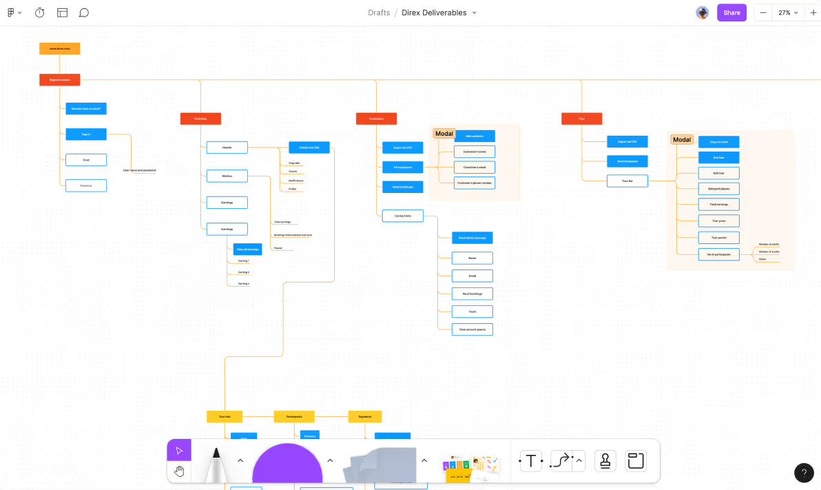
I came up with an information architecture. Information architecture (IA) is critical in ensuring that the online application is simple to use and navigate for both merchants and customers. I was able to build an IA that suited the demands and goals of the user personas. I was able to develop a simple flow that would allow merchants to simply organise and manage tours by splitting the app down into smaller, manageable components. In addition, I ensured that the IA was adaptable enough to accept future features. This will assist Direx in remaining relevant as the travel and tourism business advances over time. The end product was a clear and effective IA that would dramatically improve Direx's user experience.
Bringing Ideas to Life:
A Visual Journey
The application doesn't require authentication to use. Our goal was to make the platform easily accessible to anyone without the need to create an account, which can be a barrier to entry for some users.
To track the platform's performance, we use the amount of Composer packages tested.
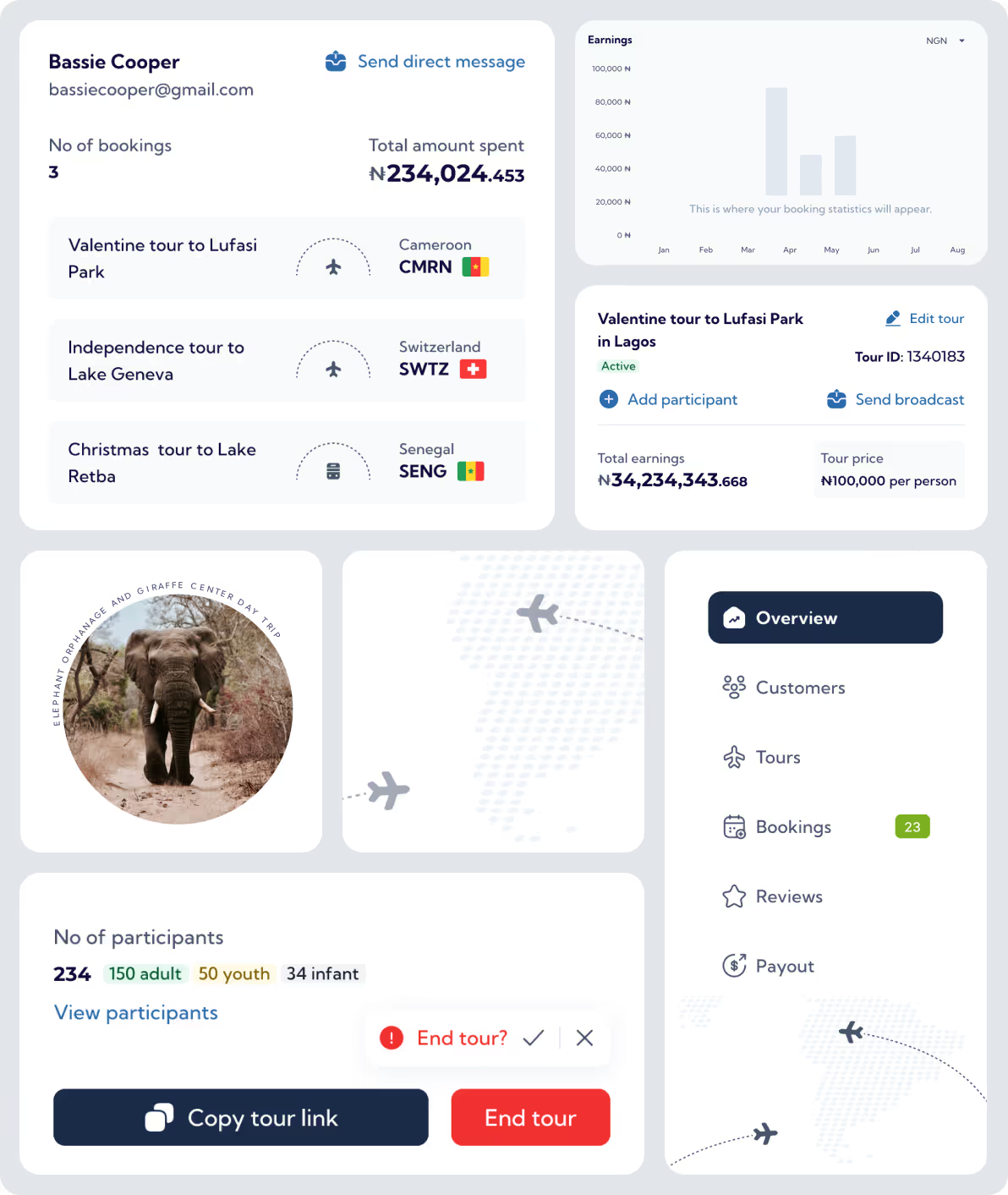
Let’s dive in 🚀..
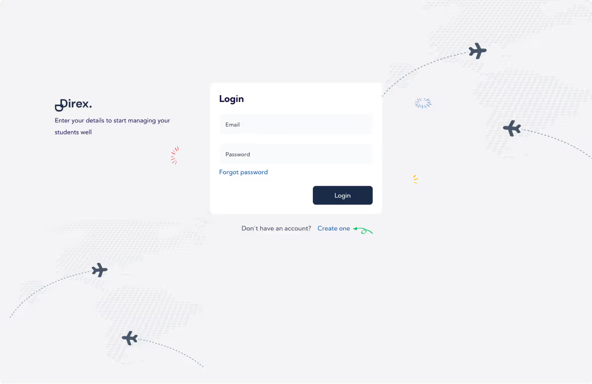
To begin with authentication, users receive their login credentials after they have been verified by administrators. Therefore, only the login page is required for authentication in this case.
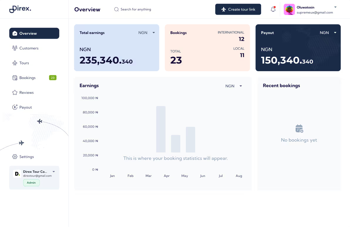
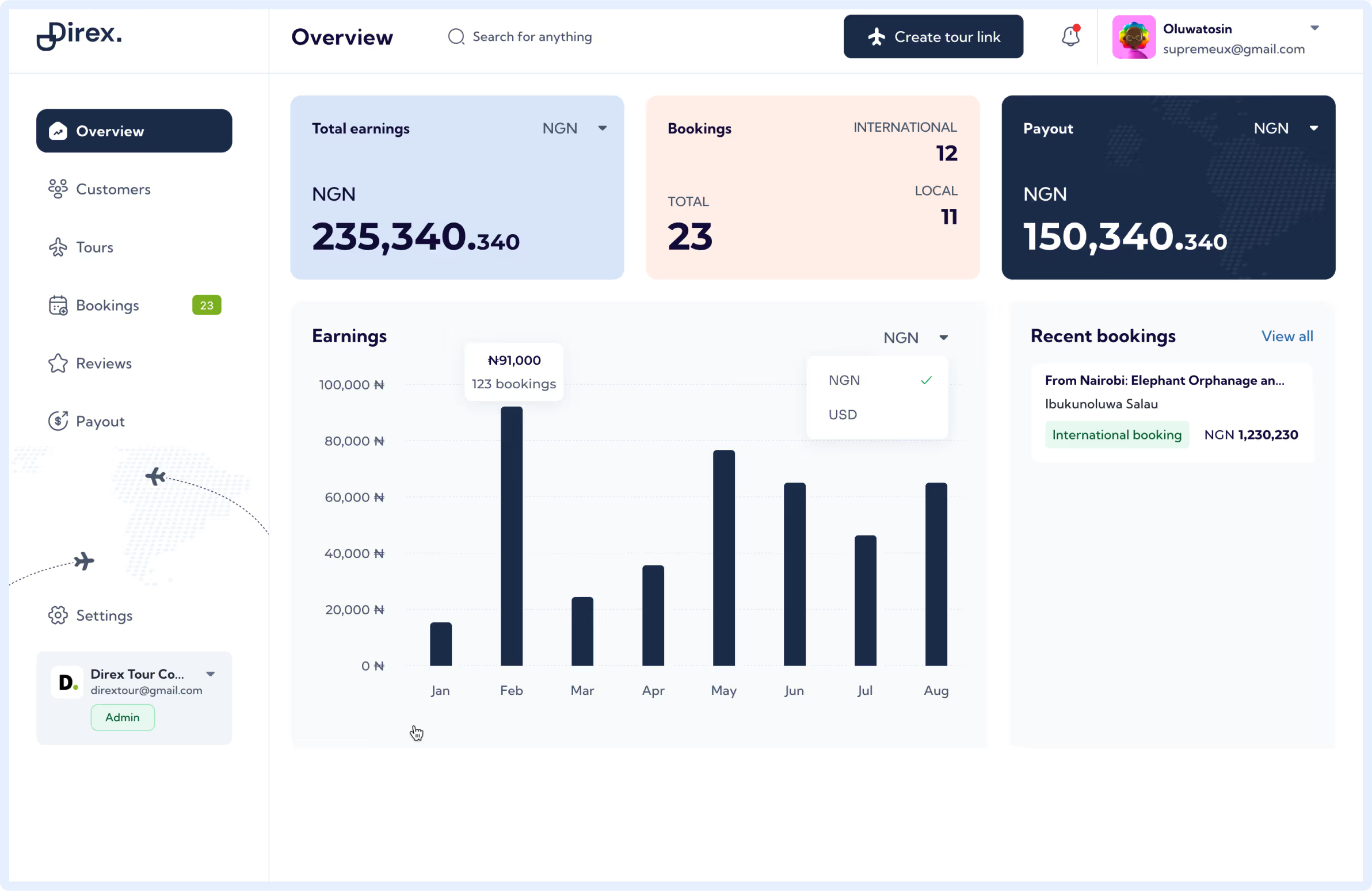
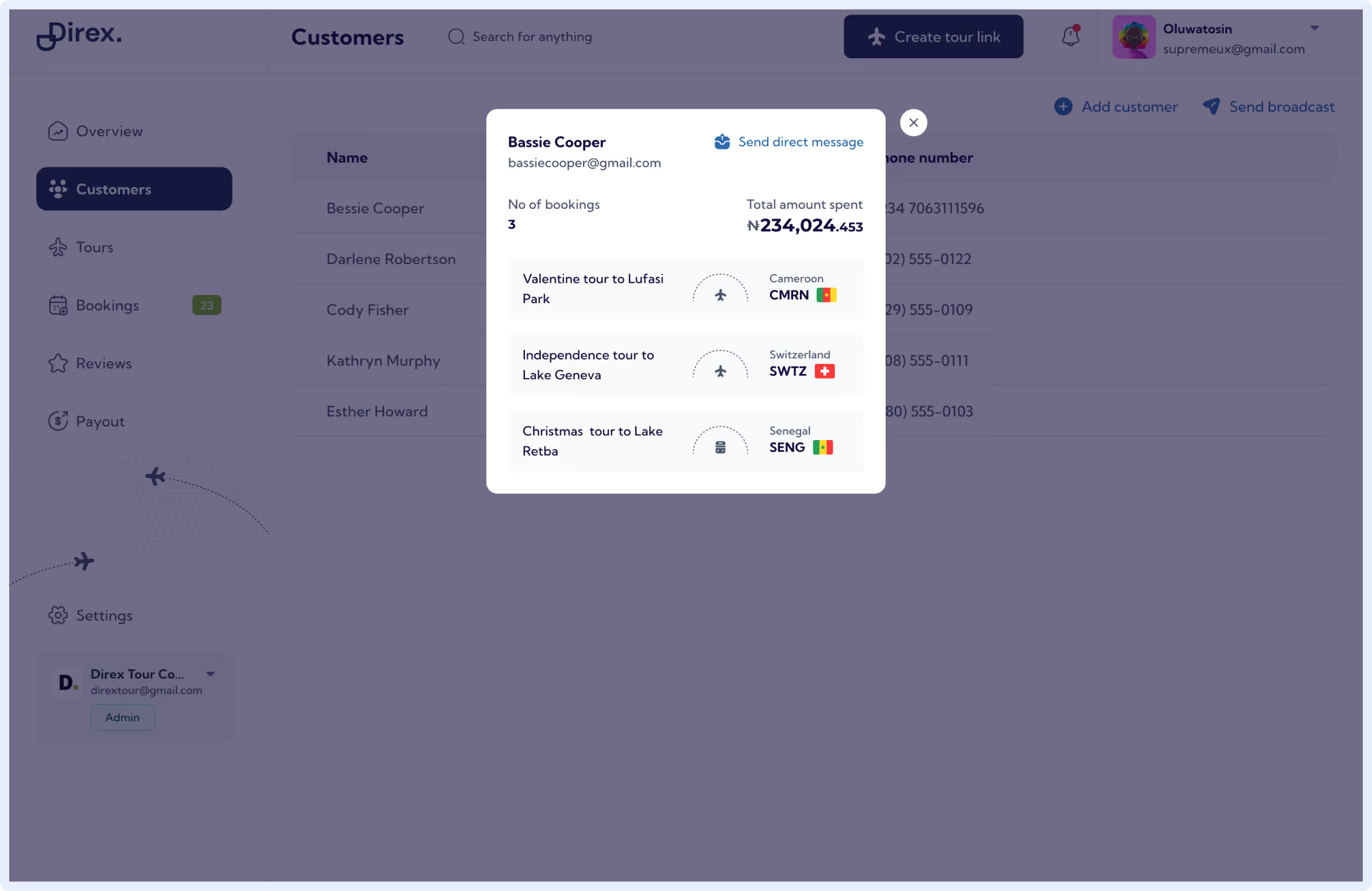
dashboard and more... 🚀
To begin with authentication, users receive their login credentials after they have been verified by administrators. Therefore, only the login page is required for authentication in this case.
Tour booking.
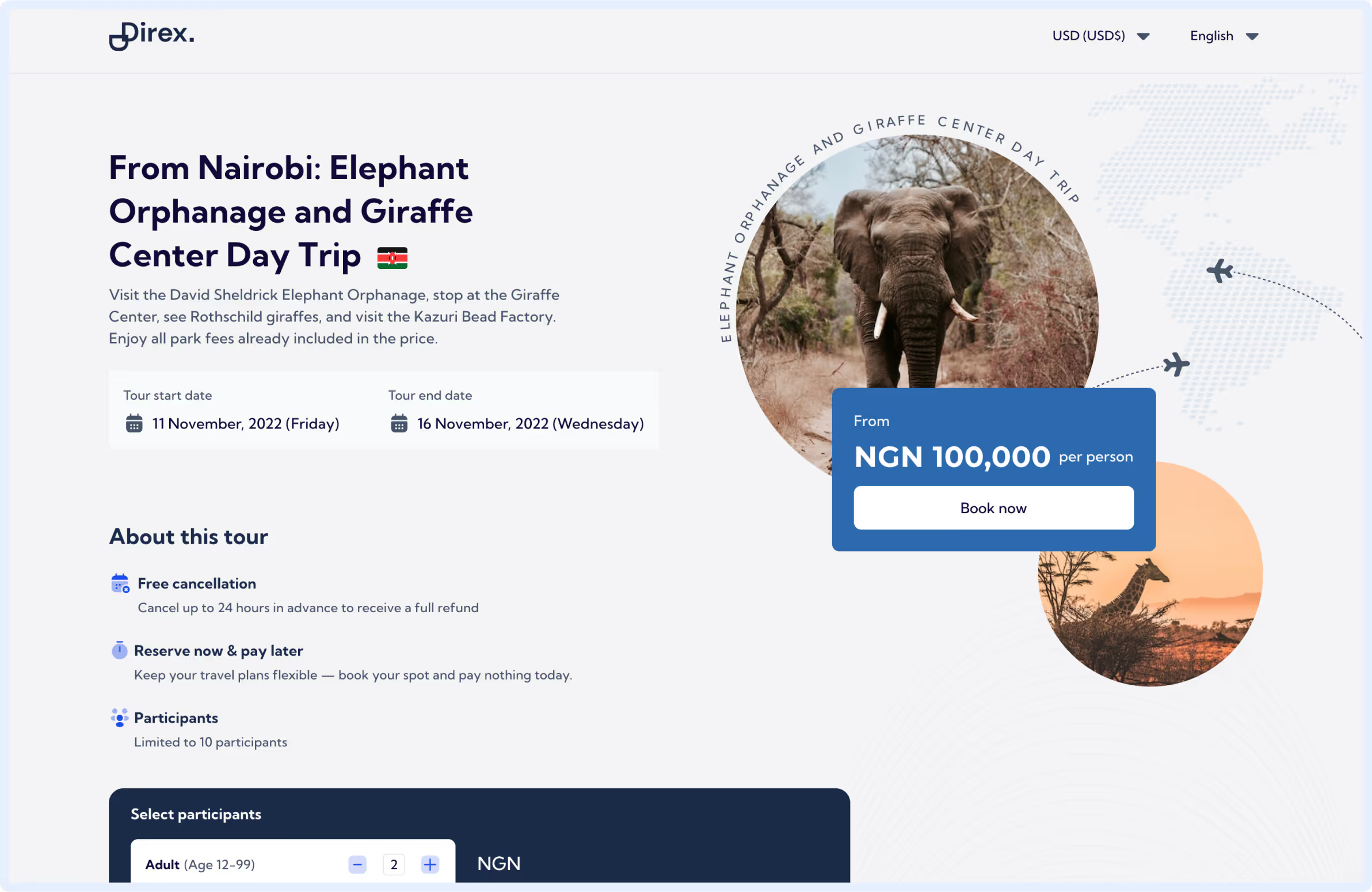
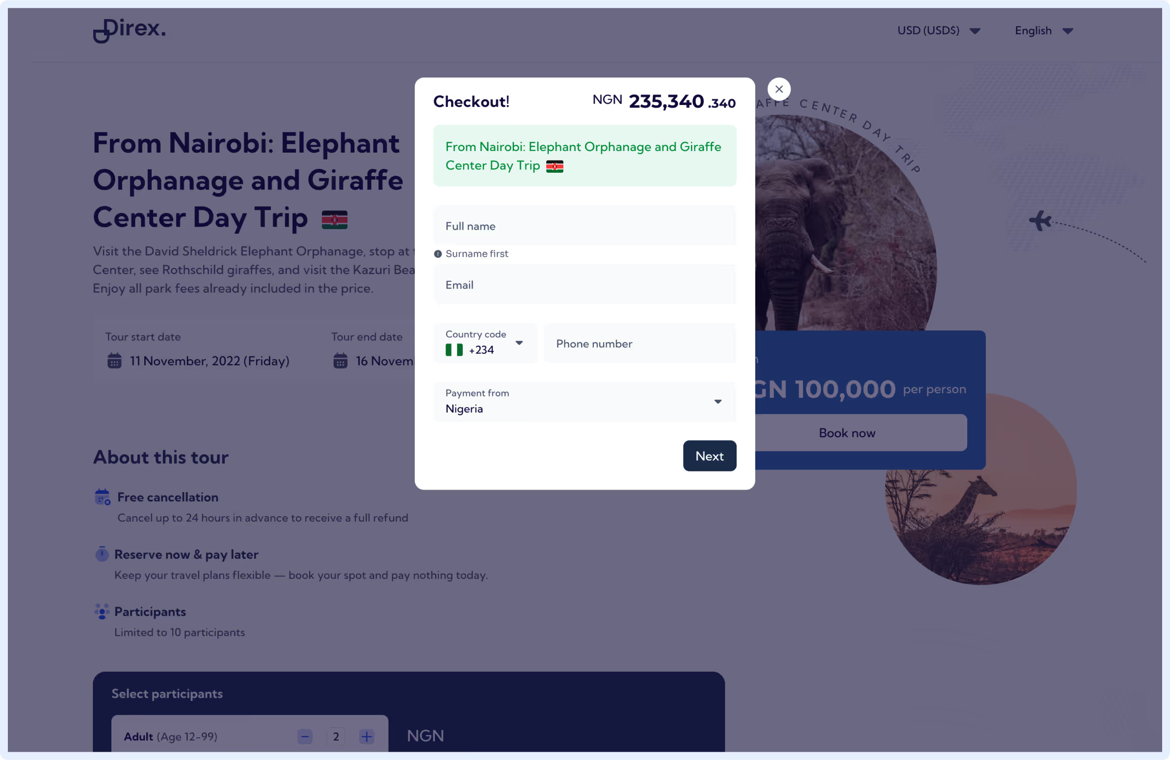
When a tour link is created, this page for booking tours is produced. The page shows data that the administrator entered when they made the tour link on their dashboard. Users no longer need to look up additional information online to book their tour thanks to this design. Users can choose the number of participants and finish the booking process on the same page thanks to the smooth booking process.
Participants have been divided into three groups: adults, youths, and infants to streamline the process and assist admins in getting ready for tours. This categorization not only simplifies the booking process but also makes it possible for admins to gather relevant data for their tour planning. Overall, this layout makes sure that both users and administrators have a simple and hassle-free booking experience.
Conclusion
Having learned so much about the workings of tour merchants, I found great satisfaction in contributing to this project. This new information greatly aided my design choices, allowing me to come up with the best possible solution to the issue at hand.
But the project's beta testing phase was the most fun of all. User reaction to the new layout has been extremely favourable. Users were pleasantly surprised by the platform's complete redesign, and they showed no signs of resistance to the change thanks to its user-friendly layout.
Because we prioritised our users' requirements throughout the project, I believe we have achieved great success. Their affirmative responses have reaffirmed this notion, and we anticipate further opportunities to enhance our offerings in response to customer comments.
The end. ✌️
