


Sandbox
Design System.


PHPSandbox was founded by @bosunski in his room when he was in his final year. He’s a PHP developer and he has always loved to contribute to the PHP community and the developers’ community as a whole. He wrote his first line of code using a Java phone. His experience made him want to build something similar for PHP. He wanted to build something that indeed provides an all-encompassing and robust solution while allowing users to code from their browsers without restrictions and ensuring that security is at the platform’s core.
How it started.
I was asked to evaluate the state of PHPSandbox, the company's flagship product and an online integrated development environment (IDE). During my heuristic analyses, I found a number of design inconsistencies, including in the colour selection and component usage. However, after speaking with the CEO, it was clear that the company planned to expand its product offering soon. Because I could see the need for consistency across products and a streamlined product development cycle, I proposed a design system. The design system would make it simpler to develop new products in the future by standardising design processes.
Leading the Evolution of PHPSandbox's Design Ecosystem.
As the lead designer at PHPSandbox, I was directly responsible for the development of the company's design system. With a thorough understanding of the company's and its users' design requirements, I identified the need for a consistent design language and a streamlined development process. I took the initiative to research, design, and implement the PHPSandbox design system because I have a passion for design and a focus on user needs.
I was in charge of conducting user research and heuristic evaluations to better understand PHPSandbox users' needs and identify areas for improvement in the existing product. Based on these findings, I created a comprehensive design system that included colour, tokens, component, and typography guidelines, among other elements.
I collaborated closely with the development team to ensure that the design system was effectively implemented, resulting in a more consistent user experience across all products.
Designing Clarity.
1. Design inconsistencies
2. Product development takes a long time.
3. Inadequate design guidelines
4. User experience is inconsistent across current and future products.
Channeling Atomic Design in PHPSandbox's Triumph.
Before I started working on the PHPSandbox design system, I did a lot of research on other successful design systems, with a focus on the Polaris system by Shopify.
I looked at their design and documentation in the Figma community and on their documentation pages to learn more about how they do things.I used an atomic design approach to make sure the PHPSandbox design system would work well.
I started by making style guides and tokens on Figma. These style guides and tokens are the building blocks, or "atoms," of the design system.
They make sure that design practises are consistent.The PHPSandbox design system was successful because the atomic design method was used and careful research was done on other design systems. This gave a clear framework for consistent, high-quality design across all of PHPSandbox's products.
Shaping Success Through Consistency.
Inconsistencies in design: The design system establishes a foundation for consistent design practises, removing inconsistencies in colour schemes, component placement, and other design elements.
Slow product development: The design system has enabled the company to ship products more quickly by providing a clear framework for design and development.
Lack of design guidelines: The design system includes guidelines for colour usage, component usage, typography, and other elements, providing designers and developers with a clear roadmap.
Inconsistent user experience: The design system ensures a more consistent user experience for PHPSandbox users by using a consistent design language across all products.
Reliance on a single designer: By providing a comprehensive design system, the PHPSandbox design system allows the company to expand its product offerings without sacrificing design quality.
Furthermore, because the design system provides a clear framework for design and development, the company has been able to ship products more quickly.The Sandbox design system has become a valuable tool for the company and its users as a result of my expertise and leadership, providing a foundation for consistent design practises and enabling the rapid development of new products.
My Project's Essential Figma Plugins.
Appearance
Appearance essentially toggles between a light mode design and a dark mode. First, you'll make the complementary light/dark style pairs, and then you'll update the plugin. It alternates between each set of colours.
Design lint
Design lint ensures your design elements are linked with the styles. With the help of design lint, you can be so sure you have no missing styles within your designs. It helps in fixing inconsistencies
Content reel
I use Content reel for placeholders. It’s a collection of collections of text strings, images, and icons. The contents are very real and it makes your design look so real.
Spelll
Typo error in design isn’t a good thing and should be very much avoided. Spelll gives Figma & FigJam a spell-checking superpower similar to that of Google Docs.
Clean Document
I use Clean Document to organize and clean up my Figma document. You can perform different operations on the plugin but the ones I use most are:
● Delete Hidden Layers
● Ungroup Single-Layer Groups
● Make Pixel-Perfect
● Smart Sort Layers
● Clean Layers

The design system is reviewed and updated on a regular basis to ensure that it remains relevant and successful in serving the needs of PHPSandbox users and the organisation.
design system Deliverables? I’ve got some
Deliverables for the design system may be confused with the components.
Here, the deliverables includes:
1. Style guide.
2. Design tokens.
3. Component library.
4. Documentation.
Crafting a Cohesive Style Guide and Themes.
I focused on making a complete set of design elements for the style guide so that they would be the same across all products. The style guide has things like colour palettes, fonts, and images.
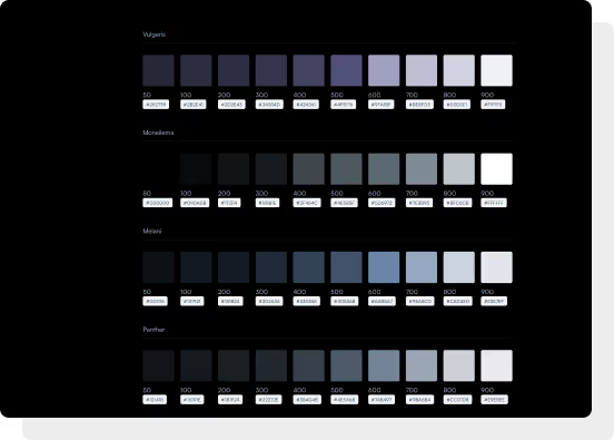
I made different colour palettes for success, error, and warning messages for both dark and light themes. I also made a number of dark theme palettes that users can choose from. To make things more interesting, I gave the dark theme palettes names like Vulgaris, Moneilema, Melani, and Panther, which are all dark animal names.
This was put into a Figma board, so anyone can easily work with the colour themes. Using a Figma plugin, I can easily switch between themes to make sure everything looks the same.
I made a small set of typescales for typography so that working with other designers wouldn't be confusing.
This also makes it easier for designers to choose fonts.
Lastly, when it came to iconography, I tried to make simple, clear, and neat icons that show what they're supposed to mean even without a label. To make sure everything is the same, all icons come from the same place. They have clear names and are put into two groups, outlined and filled, to make them easy to use.
Design token
Initially, I collaborated with our UX researcher to create a rough user flow that we could all understand. After that, I dug deeper and used FigJam to create a detailed user flow visualization.
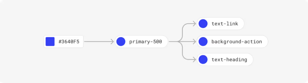
Colour tokens
We kept things simple for the colours by developing three different colour token levels.
1. Global/core token.
2. Semantic token.
3. Component token.
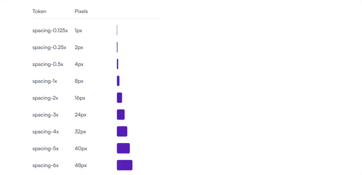
spacing tokens
To make things simple and understandable, we used a numerical scale.
typescale
The typography is also very important (around 90% of designs are text). This wasn’t hard to curate. The most used font size is 14px due to the type of product PHPSandbox is. Other fonts were captions, buttons, mono for editor etc. All these fonts are well labelled and can be easily interpreted by any designer and developer out there.
For the type scale, we defined the base and max font sizes for body and heading and IDE texts.
Body (Satoshi) - 18px to 24px
Heading (Satoshi) - 20px to 40px
IDE (Fira code) - 12px to 14px
component library

documentation
Proper component documentation is the single most crucial part of a design system. Keeping said document clear and explicit is integral to ensuring organisation-wide adoption.
We currently use Zeroheight for the documentation.

Visuals?
Projects created from the system 🚀
The design system was put to use in various projects, starting with the redesign of PHPSandbox, the company's flagship product. Following the launch of the redesign, the user base grew by 400% in just two years, and the number of registered users increased by over 300%. Check out the redesigned PHPSandbox here.


Play
Another product built with the design system is Play, an online tool for testing Composer packages without the need to set up a local environment. In under six months, it has been used to test over 600 Composer packages. Check out Play here.

Play
Another product built with the design system is Play, an online tool for testing Composer packages without the need to set up a local environment. In under six months, it has been used to test over 600 Composer packages. Check out Play here.


